 Kindle review, in an overall article about the new Kindle firmware update, says that the screen contrast is much better for some Kindles than others:
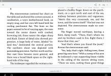
The text is darker and the contrast with the background is much better. On the Kindle 2 Global it’s absolutely striking – it seems as if the text has been bolded and the darkest dark chosen for text color. On the Kindle 2 US it’s better – However, it doesn’t seem as if the text is bolded and the background isn’t as clear. This might be due to the Kindle 2 US being from Feb 2009 and the Kindle 2 Global from March of this year.
What’s puzzling is that on the Kindle DX global the change is not as good on the Kindle 2 Global although that’s been bought this year too. Perhaps its differences in individual Kindles which would explain why some people aren’t finding a huge difference.
The net result of Kindle 2.5 font improvements on the Kindle 2 (International) is that the screen contrast is now marvelous.


I’ve got the Canadian version from last November when the Kindle became available here. I must say the reading experience with the upgrade is now much better. The font is definitely clearer and much easier to read.
Now, if only the Kindle would read Adobe DRM ePubs I would be absolutely thrilled.
Likewise on my K2 (US version), the contrast is much better. Another great improvement is in blogs, newspapers, and magazines (after tapping the number in the sections list) where I get the first few lines of the article now, something that didn’t happen before. Also love Collections and feel I have a handle on all those books waiting to be read. A fantastic upgrade, in my opinion.
I’m not noticing a difference on my US-only Kindle 2. I’m a bit disappointed I must confess. Anyone else seeing this?
Paul, I don’t see any difference in my K2 U.S. either, which is at v2.5.2 but my K2 had darker fonts than seen in the photos of many I know. It’s fairly close to the K1 fonts but the latter are remarkably clear and I’d like to see that again.
I was hoping for the v2.5.3 that is said to be the software that makes a difference. Why they can’t just bold the Home listing is beyond me. It looks fairly anemic next to the vividly beautiful DX US and the old Kindle 1. It varies. It’s looking a bit darker today but not as much as I’d like it to be.
What can help in dimmer light is this. Change font size from default ‘3’– to ‘4’ and then press (on the K2 only) Shift and Alt keys together with the left hand — and type ‘2’ as the setting for spacing between lines.
That gets you a bolder looking font and not so much space between lines. I like it for night time reading by lamps not close by.
You can try a lot of combinations that way. In bright light it is very readable set at ‘1’ and they went for sharpness (which means leanness too) vs more width in the font that makes for more black ink to the surface.
Hey that’s really good advice. I will definitely try this!
I’m with Paul. On my K2 US I’m seeing NO difference in the font. I’ve been using the UFH (font hack) and have become attached to the Georgia2 font. I removed it a few days before the 2.5 update became available, and realized how inferior the default K2 font is. After the update, I see little if any difference. Very disappointed, and now I understand that there is no way to get the UFH working under 2.5, as they “fixed” the vulnerability that made this hack possible. Gee thanks, Amazon for making my K2 secure….that kind of vulnerability sure was keeping me up at night! NOT 🙁
Anyway, I have to have MORE light now to read at all, and I cannot read for as long as I did without headaches. Ugg. I have emailed Amazon to ask is there is a DOWNGRADE bin to go back to 2.3.x and they promptly replied with misinformation, and then replied again to say “sorry no there isn’t”.
I’m so bummed. Oh, and the 2 new larger fonts are USELESS for me. If there was a new font that was about 15% bigger then the old largest one, I believe that would be perfect for me, but now the old largest font is too small and not bold enough, and the two new ones are ridiculously huge.
Oh well, time to get an iPad maybe? 🙂