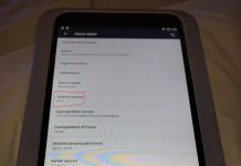
 Given that I’ve reviewed the Windows 8/10 and iOS versions of the Nook Reader app in previous nights, I might as well complete the trifecta by looking at the Android version tonight. This is the one that runs on the most devices that I own, after all—my phones and my tablets, including the Amazon Fire (thanks to my installation of the Google Play store). And how could I resist checking out Nook on my Fire?
As with the other two versions, the interesting thing is the similarities and the differences—and the differences are a bit more pronounced in this version of the app.
As for things that are the same, the home menu is similar to that of the iOS version, including access to the “B&N Readouts” free samples section, with the same books in it as viewing it on iOS. Also, the text menu is quite similar to that from the iOS version, featuring access to multiple fonts, the ability to change size, and the ability to adjust margins and paragraph spacing. The menu works slightly differently depending on if you’re viewing it on a phone or tablet. On a phone, it’s split into two panes you switch between, while the tablet has it all in one. I imagine it’s the same on the iOS version, too, but I don’t have an iPhone to check.
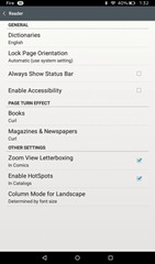 The differences begin with the really quite extensive settings menu, accessed by the three-dot icon in the upper right of the status bar. This one includes quite a few options that aren’t available in the iOS version or the Windows version, including some of the ones that are accessed from the “text settings” menu in iOS. Here we have a text-to-speech Accessibility mode that reads the book aloud. Strangely, this is the only version of the Nook reader that seems to have such a thing—it’s completely missing from the iOS version. But maybe iOS’s universal text-to-speech settings work with the Nook app there, too? I haven’t checked.
You can also set the page-turn animation to “curl,” “slide,” or “off,” separately for books and magazine/newspapers, enable or disable zoom view letterboxing in comics, and enable or disable “hotspots” in catalogs. I had to use Google to find out what that meant. The Nook HD+ FAQ explains that hotspots are “a small highlighted region that provides interactive features” such as external links that open in the web browser. Well, learn something new every day.
There’s also an option to turn two-column-in-landscape on, or off, or set it to go by the font size—smaller fonts get two-column view, larger gets one-column. But what isn’t here anywhere that I can find is an option to disable full justification. That seems to be reserved to the iOS Nook Reader alone.
With the configuration options out of the way, let’s turn to the reading experience. Right away, I noticed something weird with the e-book of So You Want to Be a Wizard, which I had checked in my original Nook for Windows review and my recent Nook for Windows 10 review. In those, and in the iOS version of the app, the book had almost no indentation and blank lines between the paragraphs.
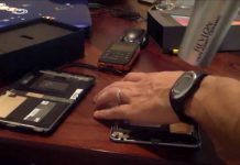
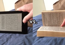
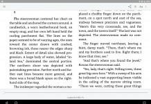
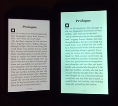 Well, in the Android client, there are no blank lines between the paragraphs, but still almost no indentation, so the book is very hard to read that way. Here is a photo of of my Nexus 6 and my Fire showing the first page of it side-by-side so you can see what I mean. Look at those big blocks of text. On the Nexus, you can hardly tell that first paragraph ends at all, going by the left margin. This makes reading it notably awkward.
This formatting bug seems to be entirely the fault of the e-book file itself. When I tried it with Joe & Julius, one of my own e-books that I created myself in Scrivener, it still appeared exactly as I formatted it, with large indents that make it easy to separate the paragraphs.
More than anything else, this is a great argument for cracking the DRM on e-books you buy—so you can use Calibre to reformat them so they actually have proper paragraph indentation and proper left-justification if you prefer. I honestly don’t think I could read the as-sold version of So You Want to Be a Wizard this way. At least with the blank lines between paragraphs in the Windows and iOS versions, you can tell at a glance where one paragraph ends and the next begins.
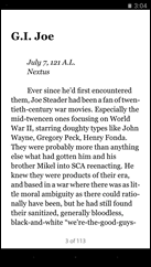
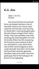 The really weird thing comes if I enable the “Publisher Settings” switch, which is in the font options screen just as it is in other versions of the app. All it does is change the font to Mundo Sans, lock it into wider margins, and disable changing the font size—and nothing else. This is even the case on Joe & Julius. As the e-book’s putative publisher, I certainly didn’t set it to use Mundo Sans!
Where I could see using the iOS version of Nook as your everyday EPUB reader, as well as for reading Nook books you buy, I’m less sanguine about the Android version. It seems to me that, at the very least, the app from a commercial e-book vendor should make it easy to read the books you buy from that vendor. As stated, I couldn’t see trying to read that e-book I actually bought in this.
You could still use it to read DRM-free EPUB e-books, given that you can use Android’s open-with dialogue to sideload files you’ve downloaded just as in the iOS app—but given that there are significantly better readers for that, such as Prestigio, why would you want to bother with Nook?
I really hope this app improves eventually. As it is right now, I just can’t see much use for it.


