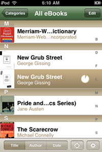
 An update of the B&N eReader is now showing up at the App Store. The store simply mentions “bug fixes” and “new file” support. Hmm. Any guesses? Anything ePub- or DRM-related? Meanwhile some users are reporting crashes with the new version.
The app, by the way, so far has drawn only two and a half out of five stars from App Store users (Stanza and Kindle for the iPhone do slightly better, with ratings of three stars). I can see why. I waited forever for the B&N app to open up Pride and Prejudice, my test book, though it did better the second time around.
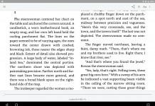
Looking over the font selection, I notice that B&N eReader still lacks a nice, bolded font like Arial Rounded MT Bold, which helps makes reading in Stanza so much more enjoyable for me. I’ve begged B&N for a nice heavy type, and I don’t just mean the hard-to-read Marker Felt.
Alas, I guess that would be like asking B&N, Sony or the Kindle people for the capability to vary the weight of characters—the extent of boldness.
Look, I’m rooting for all these companies to succeed, but for this to happen, maybe some product managers need to remove the wax from their ears. I’m hardly the only user who would be immensely grateful for the bold option.


