 When TIME magazine ran a summer movie preview feature in a recent issue, looking at three eco-disaster movies set release soon, two from America and one from South Korea — “Godzilla,” “Into the Storm” and “Snowpiercer” — its editorial and design team offered readers worldwide two different magazine layout in the print magazine’s four global editions and its online website (which has a paywall). I read the article with interest because I was interviewed for the story about two months ago and I was quoted briefly near the end of the article, so I studied the ways in which the print and online presentations differed from each other.
Both presentations were good — and engaging — but it was also interesting to see how a different headline can change the way a story is perceived by readers and how the additional elements in the print magazine’s contents page added to the to package.
I created a short blog post at my local blog in Taiwan just to show readers how the two versions differed in presentation, although of course the text was the same in both. The online version displayed a small Godzilla illustration by Turkish artist Eda Akaltun, now working in Britain, while the print edition gave her artwork a full page treatment, top to bottom, making it the middle page in a three-page article.
To see the differences, check out the magazine and the website yourself or take a look at my blog post.






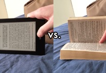









UPDATE: A friend of mine in Florida, Stephan Malone, a longtime student of print vs pixels and loving both, and an author of a nonfiction book about climate issues online at Amazon in both ebook and POD editions, tells me re the TIME editions of print vs pixel , above, his POV:
“I don’t know much about Time’s current circulation ratios but I do know that their online digital edition is doing poorly. Their Kindle version is rebutted with bad reviews, mostly complaints regarding content issues. TIME is not even in the top 25 selling digital magazines. They are beaten into the ground by the likes of Maxim and Nylon online. …..
”There are probably two different media departments that handle each version, print and digital. The trade publication’s print version has a demographic in mind that is older. Perhaps they guess that “Cli-Fi” is too dangerously close to the newer generation’s memetricization tendencies for their older (?) readers to handle so they didn’t use CLI FI in the print edition headline just “Nature Bites Back” . ….it truly is sad to see such a great American icon like Time magazine diminish in influence over the people. ”