 When you make a decision to publish your book only in digital format, you are also making essential change in how you approach cover design. You no longer have to deal with dots per inch in a high-quality print.
The goal is not 9 x 6 inch, 300 dpi any more. It’s 1024 x 600 px, 118 ppi of a typical netbook’s screen or 800 x 600 px, 167 ppi of a Kindle 3 display.
We also have to keep in mind that the readers very seldom will have a chance to see the cover in full screen. If yes, it’s going to be after the book is purchased.
Resolution of electronic screens as well as sizes of images displayed on them are changing the way we should look at book covers. It’s limiting on one side, but it’s good to focus on finding benefits – and that’s what I’m trying to do with this series of posts.
Size
People judge books by their covers. It’s still true, but while designing for the web we have to switch the perspective. In my opinion: totally.
Let’s use the example. Someone wants to buy a technothriller. In a bookstore, when you look at the shelves, you just see the covers, nothing else. The cover is using 100% of space devoted to a book – because this is a book.
Things change dramatically when you browse for the same book on the web. Check the screenshot below from Kindle Store. The cover of a single book has an average size of 80 x 115 pixels! This is the size of the book at a very important moment – the moment when the reader makes a decision which book to click and possibly buy.

Typical search page in a Kindle Store
If we treat browser window as a bookstore’s shelf, the four book covers you see above take no more than 5% of the total display space.
Obviously, this applies not only to ebooks but to print books as well. It’s a pity that you spend long hours to design a beautiful cover, worked out and retouched in every tiny detail and afterwards what you see is 80 x 115 px thumb.
It gets a bit better when you open a page with a single book. A size of the book cover area is set to 300 x 300 px – and this includes the margin and Kindle bar at the bottom. That makes 9% of the display – at best.
A book cover takes up to 9% of the total space devoted to a book

Not looking good, right? What can we do about, then?
There are a couple of solutions.
1. Make it look good when it’s small
One thing every cover artist has to keep in mind, is that a book cover should look good not only when it’s enlarged, but also when it’s reduced. Before finding a general concept it’s good to have in mind that a cover could be communicative also when it’s in a thumbnail size.
Think of what is the most important part of the cover – and try to make it more visible. What would be seen as dirt when a cover is small? Try to remove it.
2. Remove some elements of the cover
As I wrote in an previous post, all elements of the cover which convey text information are duplicated by other parts of the web page, so it’s not mandatory to keep them in the layout. Instead, it would be great to focus on finding a relevant, convincing key visual, which works well in both big and small size.
3. Test check different sizes
When designing a cover you can check from time to time how it looks in a medium size (f.e. 300 px in height) and a thumbnail size (100 px in height).
4. Optimize the cover for a specific destination
This is the thing you can always do. If you want the cover to be displayed at your blog and the width of the post area is 500 px, save your cover specifically with that width. While doing so, you’ll have opportunity to enhance and adjust the elements which don’t look good enough at this size.
Another example: if you plan to publish a book only at a certain self-publishing platform and this platform is optimizing the look of the covers to specific size and proportions – prepare a version exactly with the maximum dimensions of both width and height.
5. Think of a cut-out area
When you’ll plan the layout it’s good to think of what you could cut out of the cover that would represent most of its values. Think of a square area like a title or a main illustration, which you can use at web sites which display small book covers. Why square? Because it’s the proportions many web stores use to display their products. Both vertical and horizontal images have chances to be equally visible.
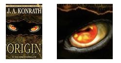
Check below how the cover I’ve already used in this post, J.A. Konrath’s Origin, looks when displayed in 115 px height: regular vs. cut-out:
Resolution
Designing for screen means designing in smaller resolution – and this is a big opportunity. You don’t need to have a super powerful desktop computer to create the ebook cover. It’s very probable that a laptop you own can do the job. Additionally, you don’t have to use dtp programs like Adobe InDesign or QuarkXPress. You can create everything in a photo editing application.
The maximum resolution to think of could be the one of displays used for reading. As I wrote above, before the purchase the chances to see a full size are small. Assuming that the image would exactly fit the screen, the cover tailored for iPad should have 1024 x 768 pixels at 132 ppi.
There is another opportunity – you can use a camera in your smartphone to shoot pictures to be used in a cover. A photo taken with an iPhone has a resolution of 2592 x 1936 px. This is especially exciting as you can design a cool cover solely on the smartphone using one or a few applications. Take Instagram. You can apply one of cool vintage filters to your photo. If you’re using the app frequently, just think of it as a tool to grab ideas for your next book covers.
If you want to add a title, you can use another great app, Picture Show. It allows you not only to apply several filters and effects, but offers a simple type tool. You can design the whole cover just with this one application.
If you write a non-fiction book, you can get a professional look by using a Phoster application. It provides as much as 72 design templates and they all are fabulous. Read more about this fantastic app here.
Smaller resolution means also that you’ll have to spend less money for images. Many services, naming only iStockphoto ot Fotolia, charge different fees depending on the file size.
For example for this vintage photo from Fotolia you’ll have to pay:
– $0.75 if you buy a 375 x 320 px file with 72 dpi resolution
– $6 if you buy 3124 x 2664 px file with 300 dpi resolution
The issue of a size applies also to print books as it comes with a question where for a first time we get in touch with a book or/and make a decision to buy it. Is it a bookstore where I can take in my hands a beautifully printed copy of a book – or is it a web site, where the book is represented by 80 x 115 px part of a screen?
Make it look good on a screen and when it’s small – this is my general advice on size and resolution.


