Last month, Amazon announced that they are selling more e-books than printed books for the first time. For every 100 hardback and paperback books sold on Amazon, 114 e-books are downloaded. The company says that we are experiencing a “reading renaissance,” and book publishing stats also show that adult e-book sales grew 49 percent last year, selling nearly 100 million units.
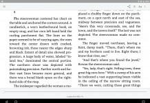
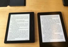
It seems that e-books are gradually replacing traditional printed books, but will printed books ever die out altogether? Regardless of whether texts are perfectly translated onto digital reading devices, most e-books tend to lack the individual character that is present in printed books. Much of the typography, layout and design of traditional print publications can’t be displayed on some e-readers, most notably the market leader, Amazon’s Kindle. It means that every novel looks much the same, whether it’s Kafka or Kipling. Reading e-books can turn into a boring experience when book after book has the same basic layout and typeface.
It’s a shame, because e-readers clearly have their advantages, displaying content with print-like clarity and offering a range of other advantages over traditional books. Publishers are missing out on the opportunity to publish something truly unique in favor of publishing something which will work on a wide range of e-readers.
Publishers format an e-book in a way that ensures the text flows property regardless of device, screen size or font. Designers and publishers are accustomed to having complete control over the appearance of their books, but now, design needs to be flexible and capable of being displayed well on a number of different devices. While some e-readers offer publishers a great deal of control over the appearance of their e-books, the Kindle offers very limited control. This is why typographic expression is particularly lacking in today’s e-books; the Kindle only offers one typeface.
EPUB was developed by the International Digital Publishing Forum (IDPF), and is accepted by most popular readers, apart from the Kindle. EPUB is based on XHTML and CSS, a popular markup language and style sheet language, respectively, for Web pages. These languages offer much more control over design and layout than other formats. The Kindle’s file formats, however, severely limit the amount of control publishers can have over the design, layout and formatting of their products, and this really impacts the quality of the reading experience of most of today’s books. Unfortunately, the Kindle is one of the most popular e-readers on the market, and it’s holding back e-book design as a whole.
Great design and bespoke typefaces play an important role in forming the identity and personality of a book (see the example above, from Alice’s Adventures in Wonderland, of text designed to resemble a mouse’s tail), and this is missing from the world’s most popular e-reader. The best we can hope for is that eventually, one fairly-flexible e-book format will prevail and become the standard, as is happening in China and Taiwan.) Hopefully this will be a non-proprietary publishing standard which can distinguish between content and presentation. Using fairly simple markup languages like CSS makes a lot of sense too, as it means that users can relatively easily edit the “look and feel” of a book based on their individual preferences. This could be particularly important for visually-impaired readers who require text to be of a particular size, color or shape.
This post was written by Alan Cairns, a journalist, copywriter and SEO from Brighton, UK. His website is www.alancairns.co.uk.
* * *









Any format which can display images can show as much ‘great design and bespoke typefaces’ as customers are willing to pay for. Thousands of e-books already exist as scanned PDF formats which exactly reproduce all the typography of the original — but they’re not making a conspicuous dent in the market, other than for comics. All the indicators seem to show that what people really want is content. Get THAT sorted and make it available at a reasonable price, and then those who crave pretty typography can pay extra for it if they want to.
“The Kindle’s file formats, however, severely limit the amount of control publishers can have over the design, layout and formatting of their products, and this really impacts the quality of the reading experience of most of today’s books. Unfortunately, the Kindle is one of the most popular e-readers on the market, and it’s holding back e-book design as a whole.”
KF8 is basically an ePub using Amazon’s DRM scheme.
The ePub 3 format is quite versatile in this respect (see SVG text on a path). Also in ePub 3, there’s fixed layout, media layers and all sorts of cool stuff. Apparently Amazon doesn’t put much store in these things at this time. Others offer better support for ePub 3 so readers and authors have choices.
Agreed that this is a problem of implementation rather than a limitation of the technology. Publishers just aren’t used to the tools yet, even though they’ve been laying out books digitally using DTP software for ages. As for boredom from the same uniform typefaces, has anyone seriously taken Penguin to task lately for insufficient variety in its Penguin Classics typefaces, for instance? And a reader can often change the fonts. Also, what about all the potential for new design tweaks that can’t be implemented in old-style print?
I’d be more worried about publishers being driven onto the Kindle standard just because Amazon is the dominant provider, like the old VHS vs Betamax or BlueRay sagas.
> KF8 is basically an ePub using Amazon’s DRM scheme.
I understood it to be mobi,, not ePub.
“his is why typographic expression is particularly lacking in today’s e-books; the Kindle only offers one typeface.”
The Kindle offers five typefaces; six if you count Caecilia Condensed as separate from Caecilia.
” The Kindle’s file formats, however, severely limit the amount of control publishers can have over the design, layout and formatting of their products, and this really impacts the quality of the reading experience of most of today’s books.”
This is exactly what I bought an ereader to avoid – publishers think they know better than I do, who use tiny typefaces, who use unreadable typefaces, who use the same snoozefest typeface in every book, who use coloured type, who (to stretch a point) fake-deckle their edges, who think every pulp novel needs a giant heavy trade paperback release…
I bought a Kobo so that I can set my own fonts and sizes and line spacing and margins, in a light and easy to handle package. The solution for novel reading, in my opinion, isn’t greater publisher control. Greater user control and more user choice is the way forwards. Some specific types of poetry, as you identify, are potentially another story; but that is a vanishingly small percentage of the market, and PDF is already available for the fixed-layout needs of this tiny segment.
Thanks for the comments. The possibilities are there but publishers aren’t making the most of them, and I definitely think that’s due to Amazon’s domination of the market.
@Steve Prior, the original Kindle Format is Mobi. KF8 is ePub compiled using a Palm database.
KF8 supports, among other things…
HTML5
Drop caps
CSS3
Fixed layouts
Embedded fonts
The current version of KindleGen creates a file that contains a Mobi file (for backwards compatibility) a KF8 file and also contains the original ePub if that’s what you’re converting from.
“Reading e-books can turn into a boring experience when book after book has the same basic layout and typeface.” Huh? I imagine the conversation:
“I found Harry Potter rather boring.”
“Did you read it in Palatino? It’s much more exciting in the original Garamond.”