 The job isn’t done yet. Responding to complaints in TeleRead and in Slashdot, Amazon promises to make the Helvetica font easier to read than the anorexic version that the latest Kindle upgrade inflicted on downloaders. Maybe improvements in other fonts, too? For now, however, the company is stonewalling me when I ask if it will come up with the best solution for K-12 kids, the elderly and others with contrast-sensitivity problems—either an all-text-bold option or the ability to use a slider to vary the boldness.
I sent Amazon five related questions. Rather than promising answers, the PR side e-mailed me one arrogant sentence: “Thanks for your additional feedback.” Yes, endlessly arrogant in context.
 While Jeff Bezos and the Amazon PR department would love to be able switch publicity on and off and control its direction, the TeleRead site is a “no manipulate” zone. TeleRead will keep defending Amazon against unjustified bashing on some other topics. We’ll also lovingly write up Jeff’s Valentine’s Day Sales and likewise help his bottom line in other ways when his interests converge with TeleRead community members’. But at the same time, we’ll keep calling attention to Amazon’s negatives. Among them is its less than stellar treatment of customers with contrast sensitivity issues and other accessibility challenges.
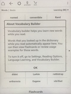
Doubt the difference between bold and lack of it for the millions who could potentially benefit? Just look at the picture, showing patches of bold within the Kindle’s “vocabulary builder.” Oh, and it would also help if Amazon offered more font size options, as well as E Ink models with text to speech. Think of the contrast-challenged children who might fare better without the video distractions of a multiple-function tablet. The Kindle is, after all, ”The Official E-reader of the National PTA” (anyone on either side care to disclose all the financial details?).
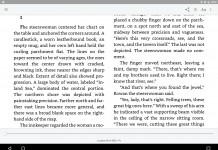
 Meanwhile TeleRead’s font-related complaints are starting draw attention in European (here and here), where Amazon has already been in the doghouse for various other reasons. “A few days ago there was in our forums already questions about the writing contrast,” says Alles eBook, a German site, as translated by Google. “Some users had the impression that the font with the new update has become pale and thus be more difficult to read. For users of a dedicated reader something is obviously a disaster, because an uncompromising good readability is the alpha and omega of eReaders.” See Alles screenshot below.
 Also, Slashdot this morning ran a follow-up, where I thank the company for the Helvetica change but call for it to commit to all-text bolding.
I don’t want to hear the standard bilge about how Amazon needs to keep things simple for users. Would “Boldface on” be such a nightmare for the typical Kindle fan to understand? The default could be off. Just how stupid do Jeff and friends think Kindle users are? Talk about technocratic condescension! As I’ve noted before, Kobo already has a font-weight slider in its E Ink devices. Are Amazon’s engineers dumber than Kobo’s (or those working for this rival company’s suppliers)? Come on, Jeff. Your resident geniuses can do it!
I’d encourage TeleRead community members to bring to Amazon’s attention the continued interest of both us and Slashdot in these issues. Write jeff@amazon.com. And while you’re at it, cc the New York Times and maybe contact the nearest Associated Press bureau or another national news organization such as CNN or even the Bezos-owned Washington Post (all these links go directly to news-tip pages or e-mail addresses). Tell ‘em to ask Amazon the same five questions I have. Yes, I know. Most people won’t bother. But try to be an exception. Even a single sentence—especially with a pointer to the Web address of this post and the one with the five questions—would be better than nothing.
Merely a single New York Times article or wire service story just could be enough to turn Amazon around. Amazon’s market cap is some $240 billion, but to one extent or another, Jeff his his colleagues are like Blanche DuBois in A Street Car Named Desire—dependent on “kindness of strangers,” at least en masse. The media got Amazon to care at least a little more about workers in a sweltering Pennsylvania warehouse and in its Seattle headquarters. Now it’s time for Amazon to give a squat about more readable fonts for contrast-challenged K-12 kids, the elderly and others in need of them. Isn’t this the same company hoping to expand in K-12?
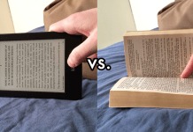
Don’t let anyone ridicule the font issue as a “First world problem.” Aren’t e-books supposed to replace p-books in school and libraries? And isn’t Amazon the main player in the e-book industry? Why can’t it act more more responsibly, especially when all-text bold capability would cost a pittance to add by Amazon standards? For now, at least for the millions with contrast-sensitivity issues, it is an outrageous lie for Amazon to claim that the so-called Paperwhite and similar models are “just like paper.”
The crazy thing about Amazon’s idiocy on the matter of adding an all-text boldface option—yes, I’ve been begging for one for years—is that even people without contrast issues would benefit. The heavier the font, the more you can reduce the front-lighting of a Kindle or the backlighting of an LCD tablet like Amazon’s Fires and gain more battery life. And, yes, to answer the obvious question, all-text bold capability should be available as an option not just in the the E Ink Kindles but also in the Fire tablets and in Kindle apps on all platforms. We’re really talking about a feature that could help Kindle dedicated e-readers at least a tad amid declining reader sales in general.
Doesn’t Jeff care about his shareholders, if not his customers? Maybe this is even an issue for a financial-show host like Jim “Mad Money” Cramer to enlighten his viewers about (not to mention tech writers for financial publications like the Wall Street Journal as well as Cramer’s own TheStreet.com). MM watchers with contrast-sensitivity issues and Kindles at hand will see the problem for themselves.
Meanwhile, with the title of the Cramer show in mind, I’ll close with the legendary line from the movie Network: “I’m mad as well and I’m not going to take this any more.”
Why Helvetica matters: For me, at least, it was the least of the evils among Amazon’s fonts. Many others agree. In any event, for me and surely for many others with contrast-sensitivity issues, the other fonts are not a solution.
About Barnes & Noble: I’m going to ask if B&N will add all-text bold through a switch or a font-weight adjuster. Will B&N catch up with Kobo, perhaps beating Amazon? My mind’s open. Let’s see what B&N has to say. I hope Amazon and B&N wise up. If I don’t get the answers I want, I’ll encourage product reviewing organizations such as Consumer Reports to make note of deficiencies for people with accessibility issues. Ideally points can be subtracted from ratings if Amazon and B&N do not care.
And just to repeat a friendly offer to Amazon: I’ll buy a Paperwrite for my local public library in Jeff Bezos’s honor if Amazon by the end of the week commits to adding an all-text bolding option within the next three months. In fact, I’ll extend the deadline to a week from Friday. That would be 5 p.m. P.S.T. February 19.


I do not understand why Amazon doesn’t have a “Advanced formatting” somewhere in third-level menu with options to set sane margins instead of Wide, Huge and Ridiculously huge, justification, line spacing, sane font sizes without gaps, and, of course, possibility of side-loading fonts.
When I got my Paperwhite it was possible to use the “USE_ALT_FONTS” hack to side-load fonts. Soon Amazon plugged that hole.
I have sold my Paperwhite and got a *MUCH* more configurable reader as soon as other manufacturers introduced front-lit e-ink readers
David, Do you know anyone who understands the technical side of epaper Kindles? They might tell you how feasible allowing user-added fonts might be. One option that might make Amazon more amendable would be for it to provide a folder in which users could side load the font of their choice. Speciality fonts of any sort could go there, so everyone would be happy, And those who don’t like technical stuff could find someone to do that for them.
Google “Kindle USE_ALT_FONT” find information about the hack another poster mentioned. Those involved might be a good source of information. This is one result:
http://www.mobileread.com/forums/showthread.php?t=224311
Failing that, you might search for a way to hack Kindles, especially the older ones. Someone who’s written for Hackaday might be willing to do that for the sheer fun of it. They love to do that and if it helps thousands of people, all the better. Here are some of the recent articles at Hackaday about hacking Kindles.
https://hackaday.com/category/kindle-hacks/
Also, the one on “3d Printed Kindle Page Turner” on that page might be useful for those with limited use of their hands. Someone should make and market and inexpensive version.
Finally, judging by stories in the media from last fall, the disaster that was Amazon’s smartphone resulted in a lot of layoffs—as if were their fault the basic design was so flawed. That could mean that Amazon’s consumer products division is a bit shorthanded right now. If so, all the shouting in the world may not accomplish much.
–Mike Perry
> They might tell you how feasible allowing user-added fonts might be.
All eInk Kiindles except the K1 and K2 have the “use Publisher font” feature so extra fonts work fine at least if KindleGen is feeling OK.
Adding a userfont folder is only little more complex.
See the mobileread forums especially Kindle formats and “Kindle Developer’s Corner” for hackers
@Michael and @Mike: Thanks, both of you. As we know, Kindle hacks can be a bit problematic, at least long term, given Amazon’s past efforts against them. Moreover, it certainly would be nice if nonhackers enjoyed a wider font selection, or at least the ability to bring in their own fonts effortlessly without resistance from Amazon.
For now, let’s see how far we can get in efforts to convince Amazon to allow for font-weight adjustment or all bold. I remain baffled why the company is so callous towards people in need of these accommodations – given the small expense of including them.
We’re really not talking about that big an extra burden on technical support. If Kobo can do it with just a fraction of Amazon’s resources, surely Jeff and friends can. Yes, Jeff has the bucks. Anyone who can finance his own private space program has the cash to add all-bold capability. We know Kindles can bold publisher-selected words. Heck, the fonts are already there, so Jeff need not go bankrupt paying for those.
@David: Thanks for making the points you mention. The fact that the accessibility issues could successfully be considered discriminatory, especially since it is true that many disabled people also have vision issues that would be assisted by adding all-bold or easier-read fonts ((Georgia, for example) or both fonts and all-bold). It could, I believe, also be argued that Amazon’s current attitudes could be construed as a violation of the Americans with Disabilities Act (the ADA), which could be really sticky for Amazon, should they be found in violation.
@Raymond Danner: Many thanks for your encouragement. The good news is that the National Federation of the Blind has been making progress with Amazon on K-12 related issues. Ideally the topic of all-text bolding and other font-related matters can come up (among other things). For now, I continue to encourage everyone to write jeff@amazon.com and speak out. I’ll be grateful if you can spread word about this post among people likely to respond with notes to Bezos.