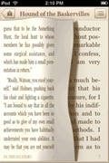
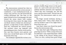
Classics ($2.99) was a great-looking iPhone app for its day. An extension of the “appbook” concept in which programmers took public-domain books, built an app framework around them, and sold them in the app store (see my review of the appbook of A Princess of Mars from this post), it bundled a number of the most well-known public domain titles together and prettied them up for iPhone-screen reading.
As an implementation of that idea, it worked all right. In fact, it looked nice enough that Apple featured it in a TV commercial—and subsequently proceeded to steal its basic format (books displayed as covers on a shelf, page-turning animations) for the iBooks app.
Overall, Classics was a good implementation of an idea, but the entire idea is one that I find highly dubious—and it has been rendered largely obsolete by the higher-resolution iPad, to boot.
(Portions of this review come from my 2009 review of the app, updated to reflect changes.)
Implementation
The idea behind Classics is to take several public domain texts and hand-format them to look more like paper books, except in an iPhone interface. At the moment, there are twenty-three public domain books included in the Classics bundle, including such titles as Alice in Wonderland, The Hound of the Baskervilles, and Dracula.
 This hand-formatting includes illustrations where available (such as in Alice in Wonderland), hyphenation (at least for some titles), and justification of text. It also includes page-turning animations, along with two different “page flip” sounds depending on whether you’re paging forward or backward. (Both the animations and the sounds may be disabled in the configuration menu under the Settings app).
There are some moderately clever touches, like a ribbon marking a book you’ve started reading, and the way the books themselves are arranged in a handsome varnished bookshelf rather than a sterile-looking menu.
The developers promised to hand-format and add more books as time went by. They apparently did so at least once; the last time I reviewed this app (in May, 2009) there were only twenty, and I seem to recall there being fewer before that previously. However, three books in eleven months hardly qualifies as a great amount of progress—the app would appear to have been abandoned.
I suspect that the iPad represents the final death knell for Classics; the way it is put together would make it impossible to upgrade for the iPad without essentially recreating it and reformatting each title from scratch. And with Apple getting in the e-book game, the ability for small developers to compete with such a limited program is basically nil.
Drawbacks
 It all looks very nice—but there are a few drawbacks. Most obviously, the time and effort required to do the hand-formatting means that only a handful of books can ever be ported to the reader; the 23 titles currently available represent only 1/10 of 1% of the titles available at Project Gutenberg (and, by extension, through multi-format sites like Manybooks and Feedbooks). This is hand-crafting as opposed to assembly-line production.
Second, the hand-formatting limits the choices of the reader. There is no way to make the fonts larger or smaller, or to change the orientation from portrait mode to the landscape mode I prefer for a screen this size. There is also no way to turn off the full-justification of the texts, which on a screen this narrow can result in unsightly large gaps between words. Everything is fixed. This is wood-block engraving as opposed to movable type printing.
Third, I question the entire need for a “p-book simulator” approach. It pre-supposes that the reason people read paper books is so they can see and hear the pages turning, as opposed to reading them for the actual content. In prettying up the pages, it locks them into a fixed aspect, and so passes up a number of e-books’ biggest advantages (resizable, reflowable text). It ends up being “neither fish nor fowl”—it might be pretty in some ways, but will not best please either e-book or p-book devotees. (At least Apple’s iBooks version is only a cosmetic arrangement of the screen border, leaving the text reflowable to the preference of the individual reader.)
And finally, as should be fairly obvious, making the books look so nice on a 320×480 screen effectively tied them to that screen. In order to create an iPad-compatible version, the developers would basically have to start all over again from scratch. As with eReader, it looks pretty fuzzy when pixel-doubled for an iPad screen.
Conclusion
Stanza, eReader, and iBooks are both free, and all can read (in one format or another) the Project Gutenberg e-books that can be found through Gutenberg, Feedbooks, or Manybooks—not just the ones someone has time to implement. They allow a considerable level of control over text size, page orientation, justification, and other options—and they don’t try to pretend to be paper (except cosmetically, in iBooks’s case), because they don’t have to. People who read them are wanting the e-book experience already.
If you can find it on sale for 99 cents (as I did), and plan to do most of your reading on an iPhone rather than an iPad, the app might be worth getting just to have those twenty-three classical books hanging around. I would be hesitant about recommending it at the full $2.99, however, except as an interesting curiosity.


Great little app. I don’t regret paying the $2.99. Although I am disappointed that the app seems to have been abandoned and not updated, I have hardly finished all 23 books. I have little to complain about.
As for the p-book emulation, I rather liked it.
Great review. Thanks.