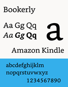
 Own a 2013 Kindle Paperwhite? Well, you can finally enjoy the new Bookerly font optimized for readability, thanks to Amazon’s latest update, 5.6.5. Same if you own a deluxe Voyage or a recent basic model.
The 2015 Paperwhite already includes Bookerly but will benefit from other features in the update, such as more goodies from Goodreads.
Now—if only Amazon would expand its typographical selections or at least let people introduce their own typefaces. Sigh, I’m also still waiting for an all-bold option for those of us who need higher contrast between background and text.
On the positive, a manual update of my 2013 Paperwhite went very smoothly—it probably took well under 10 minutes. You may already have received an update automatically. But if not, you can go here for the ‘13 Paperwhite, here for the ‘15, here for the Voyage and here for the Touch. You’ll find links to the easy update instructions.
Here’s Amazon’s summary of the changes for the ‘13 Paperwhite
- A redesigned Smart Lookup makes it easier to get to the actions you want to take while reading – highlight, create a note, share a quote, and more, while keeping your favorite Smart Lookup features like Dictionary, Wikipedia, and X-Ray easily accessible. Just tap and hold on a word, phrase, or sentence to bring up Smart Lookup and swipe right to left to see the next card.
- Bookerly, our new, exclusive font specifically designed for reading on digital screens to help customers read faster and with less eyestrain, is now available.
- New typography and layout improvements with hyphenation, justification, ligatures, and kerning, as well as pop-up footnotes, endnotes and chapter notes. These improvements are supported in hundreds of thousands of Kindle books today, including many best sellers, with more being added every week, and are currently available for titles in English, French, Italian, German, Spanish, Portuguese, and Dutch.
- Goodreads now offers personalized recommendations and author profile pages.
The seems to be about it for all three models, except that, as noted, the 2015 Paperwhite already included Bookerly.
Notice something missing? That’s right—no Bookerly goodness and the rest yet for the 2012 Paperwhite.
So, have you tried the update, and what do you think of it? My Wishlist Item #1 is, yes, all bold. What tweaks do you think should appear in the next update?
Other perspectives: The Digital Reader, Kindle Boards and MobileRead.










Until the Kindle lets me natively import my collections from Calibre, I’ll stick with my older firmware with jailbreak.
The bold font option would be nice. More font choices.
The Kobo Glow HD has a lot of font enhancements, one of which is the ability to darken the font, essentially making it bold. Also, there are many more font size increments. Likely the other Kobo e-ink readers have this, too. Surely Amazon could do the same if they were so inclined.
@Ryan, @Steve and @Mary: All great suggestions. I myself own a Kobo Aura H2O, and in readability, the difference is day and night. I know Amazon has a KISS design philosophy. But allowing such limited font choices, and not offering the all-bold option, is overdoing it! David
Just put the update on my 2013 Paperwhite. I read a lot of books in Italian and Spanish and I am going to love the smart lookup changes. I use the highlight, definition, and translate features very frequently. Great! I also noted that a new Spanish-English dictionary (and German-English, which I won’t use) loaded with the update. I agree strongly with you regarding the need for a bold option. I usually use Helvetica because it looks bolder to me.
@Lou: Thanks. Same here—about Helvetica (at least most of the time). I remain baffled why Amazon won’t add all-bold. Offering an all-bold option just would not add to the complexity of kindles or Fires. Lack of all-bold might even be viewed as a form of ageism. Older people have more trouble with contrast issues, I suspect, than younger ones do. David
I preferred Helvetica font and since the automatic update I cannot access this or others. Why oh why do they do these auto updates?
Managed to speak with an English Amazon agent about the problem with accessing fonts after latest update. Answer is to remove the book concerned from device into cloud and then add it back to home from cloud. Font styles then are accessible as previously! Pity I spent 20mins with the Indian call centre before being transferred to English guy! Original agent actually asked me to describe my Kindle paperwhite and thanked me when I told her it was rectangular, black with Kindle written on it! Hey ho…
I finally installed the update manually and immediately tried Bookerly—total disappointment. It’s too thin and faint. I went right back to Caecalia. I wish Amazon would give us some decent font choices, as well as options for better spacing spaces between lines.