 Today I received a new (refurbished) current-generation Wi-Fi Kindle Paperwhite. I saved $20 over regular price, and then another $20 thanks to the promotional offer Amazon gave me when my Touch wouldn’t download updates. On the principle that if I’m going to cover e-readers, I should have access to one of the latest ones, my publisher David Rothman covered the remainder of the Paperwhite’s cost, which was pretty nice of him.
Thanks to Kubrick, I can now download updates on the Touch, and the Paperwhite doesn’t have any problems in that regard either. So here I have one Kindle a few generations old, and another current, both current on firmware.
I haven’t had a whole lot of opportunity to play with the Paperwhite yet, though I did shoot an unboxing and setup video. If you feel like taking ten minutes to watch me take it out of the box, compare it to my Touch, and work out how to set it up, here it is:
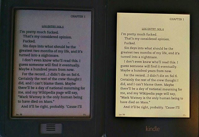
Anyway, I’ve taken a whole bunch of comparison photos. I suppose technically I should go ahead and take comparison screencaps just for the sake of showing how the font looks without the glare or reflection on the screen getting in the way, but I don’t want to go through all that rigamarole. I will do it for the Bookerly font comparison I’ll bring up shortly, though.
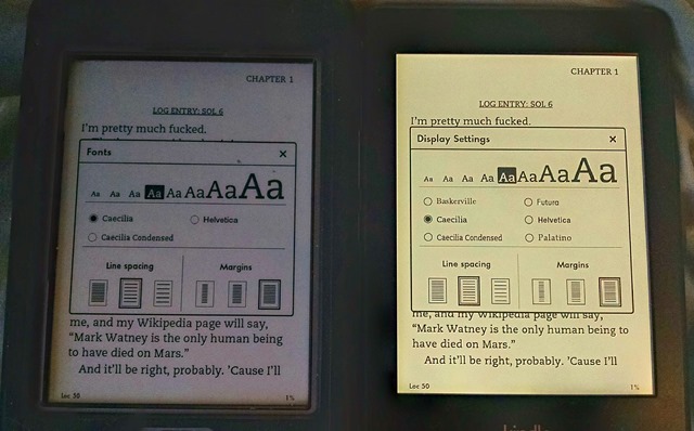
The above screencap is the Caecilia font on both, in the same font size. As you can see, the font and text placement is effectively identical—though interestingly enough, it’s actually a different relative font size, as you can see below:
On the touch, it’s the fourth-smallest size, but on the Paperwhite it’s the fifth-smallest. I suppose because the Paperwhite has a higher resolution and can go smaller if it needs to. Though this means that the Paperwhite actually can’t go as large as the Touch. Though I suppose most people who need large print don’t need it that large.
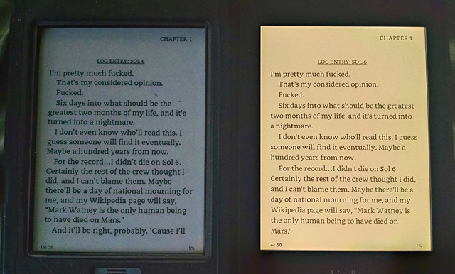
You’ll note that, on the Paperwhite, it doesn’t list the Bookerly font being available. This is because it turned out I wasn’t on the latest Firmware update after all. (I think I downloaded the latest update for an earlier version of the Paperwhite when I went to apply it.) A quick download of the later version, and here’s the same comparison, with The Martian in Caecilia on the Touch on the left, and Bookerly on the Paperwhite on the right, font settings otherwise identical to the previous picture. (I’m not going to bother photographing the font screen again. It’s identical to the one pictured above, but with an extra row so there’s room for “Bookerly” to fit in.)
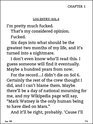
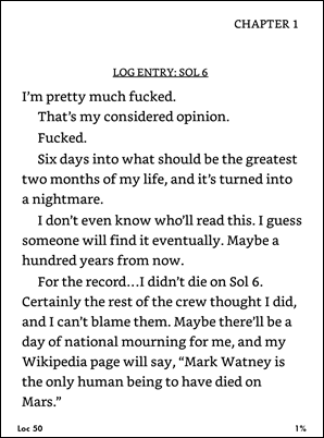
And for the sake of the comparison, here’s the only pair of screenshots I’m going to take, of the same screens shown above:
In case you’re curious, the native screenshot size of the Touch is 600 x 800 and the Paperwhite is 758 x 1024.
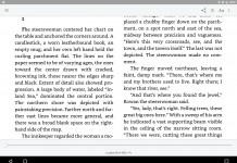
As you can see even from the pictures at thumbnail size, the one of the right does seem to have better kerning and spacing, and looks like it might be a bit easier to read.
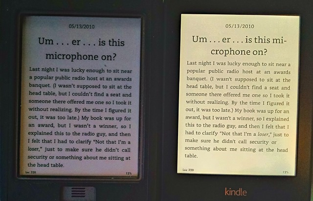
This doesn’t represent what the actual Kindle version of The Martian may look like, by the way, as this is a conversion of an EPUB version from elsewhere. Among other things, it doesn’t feature full justification the way Kindle-native books usually do, because I told Calibre to get rid of it. Also, the latest Kindle version may have fancier headers and things, the way that this next book (the free Moonlight Blogger e-book Paul recommended earlier) taken directly from the Kindle store does.
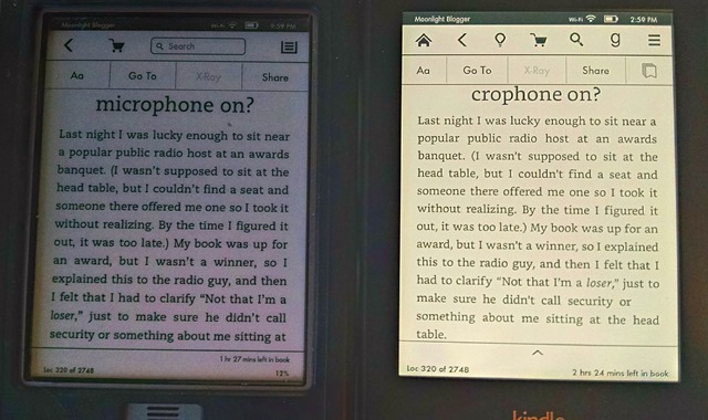
The first picture shows the new “About This Book” feature that the Paperwhite pops up whenever you open a new book that has it. The second compares the two books, Caecilia/Touch on the left; Bookerly/Paperwhite on the right.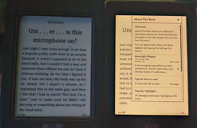
You might notice one of the features Bookerly advertises, better hyphenation, is evident from the header, but not anywhere from the actual text. Weird, huh? I personally think it actually looks better without the hyphenation, but that could just be me.
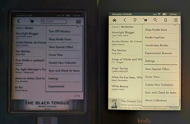
Now here are a couple showing the different menu interfaces—first from within the book, and then from the main menu.
You’ll notice in the top photo that the Paperwhite has the new “home” icon at the top left, to replace the hardware button it no longer has. It also has a light bulb icon to control backlight brightness, and a Goodreads button to access the Goodreads integration. The “search” option has shrunk from a text box to an icon you have to tap first. And the menu icon has changed from a sheet-of-paper-like thing to a more Android-like “hamburger.”
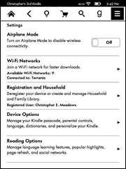 There are some interesting differences in the menu here, too. The icon bar has the same differences as above, but check out the menu differences, too. There are new options for Kindle FreeTime and Vocabulary Builder, new optional features. The web browser has moved out of “Experimental” (presumably because the Paperwhite has ditched the other “Experimental” options like the MP3 player and text-to-speech—it doesn’t even have a headphone jack like the Touch). “Turn Off Wireless” has disappeared—because it’s now found under the “Settings” menu as “Airplane Mode,” which would be a lot more familiar to smartphone users.
There are some other new options under “Settings,” too—“Registration and Household” to take advantage of the new “Household” and “Family Library” options the Kindle now offers, and “Reading Options” to manage other new features. Apart from that, everything else is much the same as in the Touch’s “Settings” screen.
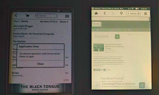
Next, I decided to play around with the web browser a little. First, I tried loading TeleRead. Both devices tried to load the desktop version. The Touch simply crashed before it got partway in. The Paperwhite seemed to do a creditable job of loading it up, but then froze up and lagged severely under the load. It may be we need to check out our website’s theme, as it’s supposed to load a mobile-optimized version automatically. We’ll just have to see.
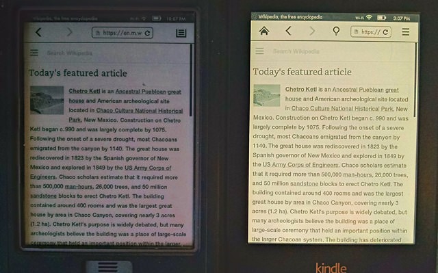
Then on the bottom is Wikipedia, as loaded from each browser’s auto-populated “Bookmarks” page. They look pretty much the same, so no big surprise there.
Apart from that, the biggest surprise is really just how similar they are. They both use very similar touch-pagination features, and they read very similarly. The biggest difference in reading them is that the Paperwhite glows, so I no longer have to worry about making sure I’ve got a good light source at a good angle for viewing on the Touch’s screen. And the Paperwhite seems a good deal faster when doing things like search (though even the Touch improved considerably with the later firmware over the early).
There’s one change that I’m actually not so sure is an improvement, though. I really miss the physical “home” button from my Touch. Getting back to the home screen now is a matter of tapping at the top of the screen, waiting a fraction of a second for the menu to appear, then tapping the “home” icon. With the Touch, I just have to hit that physical button at the bottom, and there I go. It just feels like a step backward.
You may also have noticed from the screenshots that it does indeed have Special Offers. I don’t have a problem with Special Offers; I don’t see any advertising when I’m actually reading something, and sometimes I actually do see something I’m glad to know about. I did find it interesting that the Touch and the Paperwhite get different Special Offers, or at least display different ones on the home screen. When I pull up the list of offers from the menus, it turns out that a lot of them are the same, but they show up in a different order from each other. Interesting how that works.
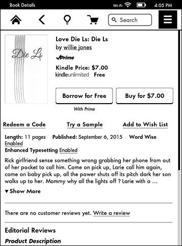 That being said, at least one of the works being Special Offered, “Die Ls” by one “willie jones,” makes me stare in something akin to a man witnessing a train wreck. The author appears to have seen grammar once and decided he didn’t like it, and he sets the price of an 11-page story at $7. It looks like one of those attempts to exploit the Kindle Unlimited payment scheme before said scheme changed to pay by the page instead of by the read.
I’m almost tempted to use the “Borrow for Free” function just to see how terrible it can be. And just how much did Mr. Jones (or “jones”) have to pay Amazon to get his book featured in Amazon’s Special Offers? Or did Amazon just decide to spotlight it at random? (That would actually be even funnier.)
Anyway, I’ll have further thoughts on it once I’ve had the opportunity to try it out at length. For now, it’s interesting to have it for the sake of comparison, and I can already tell it’s going to be great just being able to sit and read without having to worry about whether there’s a good light source behind me. That’s one of the benefits tablets have always had for me before. It will be interesting to see how it works to have an e-ink screen that glows the same way.












So how often do you normally hit the home button? I usually only need the home screen when I’ve finished reading a book. I can see when you’re doing a review and showing off all the features it’s a lot of extra taps, but for normal reading (i.e. not switching between a lot of books) I’d think it’s a rarely used button…?
I sure hope the paperwhite isn’t as yellow in real life as in the pictures or you got robbed. Mine looks white (and slightly blue if the backlight it turned up too high).
I assume it is just caused by the camera taking the pictures.
Yeah, I think that’s a side-effect of the High Dynamic Range effect on the camera I used to snap the shots so I could be sure the Paperwhite wouldn’t blow out or the Touch be too dim to see. Boy, if there was ever a case for HDR, it’s having a lit e-ink reader next to an unlit one. 🙂