![]() Michael N. Marcus, who I mentioned a few days ago when Amazon subsdiary CreateSpace refused to print his book because it mentioned Amazon (they subsequently called him to apologize and let him know that was a mistake) has written a post comparing books vs. e-books to craft vs. chain pizza.
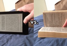
Michael N. Marcus, who I mentioned a few days ago when Amazon subsdiary CreateSpace refused to print his book because it mentioned Amazon (they subsequently called him to apologize and let him know that was a mistake) has written a post comparing books vs. e-books to craft vs. chain pizza.
The analogy is made on the basis of typographical matters and quality. After painstakingly examining a 318-page book he’s publishing line by line to make sure that word spacing, hyphenation, and so forth look as good as possible on the page, he received a copy of Dan Poynter and Danny O. Snow’s book U-Publish.com 5.0 and was taken aback by how “just plain ugh-lee” the printing in it was.
Unlike Dan P’s classic Self-Publishing Manual, (first published in 1979) the new 2010 book has oversized indents, no hyphens, and the text type is condensed sans serif. Word spacing is atrocious, every page has rivers, and there are orphans which could have been easily eliminated.
Although this is apparently a self-published printed-on-demand paper book rather than an e-book, Marcus says that the willingness of readers to accept the typographical limitations of e-books (most notably the lack of hyphenation) has led to a contamination of these practices into paper books.
Because Marcus really dislikes ugly books, he has been hesitant to release any of his books in those e-book formats he decries even though he knows it may be costing him readers and income. He suspects at some point he may come to accept e-books as a “parallel universe of publishing” rather than a poor substitute for a better-looking print book, just as one of his friends will eat chain pizza when the local Neapolitan craft-baked pizzerias where he lives are closed.
I would just add that Marcus made his observation on a blog—another venue where he has relatively little control over font or word spacing. And there is no hyphenation either save for those that come as part of compound words like “mass-produced”. And it’s also possible that the ugliness of self-published books may have more to do with the lack of the formatting services offered by traditional publishers (though you would think that people who’ve been writing books on self-publishing for 30 years would know how to do it right by now).
Our current e-book formats grew out of another area where there was relatively little typographical control at all: the Palm Pilot. It was enough back then that we could read them at all (given that they were basically shown on a screen not much fancier than a TI graphing calculator’s). Since then, formats have kept that premium on being able to read rather than looking fancy.
And so e-book formats do still leave something to be desired. (Marcus would probably be right at home with a font blog post I covered a while back about the iPhone’s typographic problems.) But as we’re getting into more graphical formats, with more processing power behind them, perhaps something can be done about this eventually. It seems to me that if a word processor can hyphenate words as they’re being typed based on a built-in hyphenation dictionary, an e-book reader should be able to do so after the fact.
In the mean time, there are at least some options. A few months ago, Jeff Kirvin wrote about ways to configure various iPhone reading applications so that they look the best and are the most readable on-screen.


Wow, people will really come up with ANY reason to complain about e-books. Now they blame bad typography on them? Travel back with me to the 70s or 80s, my friends. Grab any mass-market paperback off the racks and cringe.
I have some books in my house I’ve been meaning to read for years, and I’ve finally come to the conclusion that I’m not going to, because the typesetting and page layouts make it painful to read. Good books, bad typography.
Now, I have heard similar complaints about the advent of desktop publishing and its effect on print publishing and design… and yeah, maybe there, there’s a point. If somebody doesn’t know what they’re doing and they’re the visual equivalent of tone-deaf, yeah, they can make some UG-LEE books. But the tools have gotten better and people can be taught.
Good design is one of those things that’s very hard to automate, though…
Quick question – how do ebooks lack hyphenation?
Frode: hyphenation in e-books is mainly left to the reader software, and the reader software mainly doesn’t do hyphenation because it would require an extensive hyphenation dictionary for every language of interest.
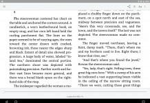
None of the big-name e-book readers do hyphenation. They’ll just put the long word onto the next line and put lots of blank space into the current line. Bookeen has claimed to have hyphenation for Mobipocket e-books, but apparently it didn’t kick in unless there was a huge gap being left, so only worked at really really large font sizes. (I know nothing about that except what I read on the Web.)
I don’t think most people care. They’re so accustomed to reading unhyphenated Web pages that an unhyphenated e-book doesn’t look odd at all. If the e-book doesn’t attempt to justify the right margin, the lack of hyphenation is hardly noticeable.
Microsoft Reader has hyphenation, and at least in English it is very well done. What about purely algorithmic hyphenation? Would people even notice if a word wasn’t hyphenated “correctly”? Probably not. Japanese, for example, doesn’t use hyphenation. A “word” can be broken anywhere. You just keep reading until you hit punctuation.
Until someone or some software comes up with an algorithm that does for eBook typography what PageMaker, Quark, and InDy–to name just three; there are certainly others–I tell my clients that it’s advisable to lose full justification in favor of ragged right when going to eVersions of their print books. eBook typography simply does not allow for good-looking full-justified text. Look at any website that attempts it. I’ll grant you, tho’, that it’s kind of sad to see a product (eBooks as a whole) out there before it’s really isn’t ready for primetime.
I find it really annoying that whenever the Kindle finds too long a word, it just leaves a major gap at the end of a line, leaving that line unjustified.
As Doug says, different languages have different hyphenation rules, and using one language rules (i.e. English) for every language just won’t do. The t2s engine in the Kindle is a good example for that.
One implementation of the Hanlin V3, the Papyre, has full hyphenation in Spanish. I think it only works with a custom firmware and only for the FB2 format, but I’m not sure.
Also, do major ebook formats allow tagging the main language in ebooks? I know ePUB does, but I’m not sure about Mobipocket. Additionally, there should be support for specific words being tagged as being in a language other than the main book. Do major ebook formats support that?
@Eugene: I would notice, at least in my mother tongue.
I’ve been getting my feet wet in ebook formats. And the Amazon format is atrocious. No floats, borders, backgrounds. Holy Cow! I don’t care if they lower the price and market the hell out of it. Why on earth would anyone buy an ebook in a format with such limitations?
Even on the ipad, there are lots of design limitations. The only way apparently to design an interesting ebook is to ditch the ebook apps altogether and make your own app….which is sad…
Hi Chris (with CC to Mr. Marcus):
Happy holidays to all. This is U-Publish.com co-author Danny O. Snow, responding to Mr. Marcus’ rant about the page layout of my book with Dan Poynter.
Not to sound defensive, but…
a) Please feel free to download the iPhone/iPad/Droid app and adjust the font, leading, kerning, etc. to your heart’s content.
b) In my world, where printed and digital material is increasingly interchangeable, a prime goal is to use a kind of “lowest common denominator” in terms of typography. Because our books are manufactured in paperback by many different printers (each with different specs), and published electronically by multiple suppliers for a diversity of platforms, each with a different screen size, default font, etc. it simply doesn’t make sense to get too anal about it. Each reader will probably see something different, depending on the medium.
Instead, Mr. Poynter and I try to focus on the information conveyed by the text. We believe that the information is what matters to our readers, much, much, much more than the presentation.
BTW, the page layout of the 2010 edition was inherited from Borders, which used it as the guidebook for its national “Borders Personal Publishing” program (circa 2006-2008) before their stock collapsed and the program was (sadly) scrapped. Like any professional writer, I’m accustomed to seeing my work appear in print with changes in content and design according to the publisher’s choice. Whining about editorial and design trivia is for hobbyists — and victims of vanity presses, who can micro-manage production details… at a price.
In closing, I recently got a rare 1912 edition of Mark Twain’s classic “Life on the Mississippi” with incredibly horrible fonts, leading, kerning, ad nauseum. Guess what? The primitive typography didn’t diminish the genius of the writer at all.
Thus endeth today’s sermon.
Respectfully,
Danny O. Snow
I’ve just discovered an amazing con. The self publish game! I’ve been an entrepreneur all my life. To begin with when you make any thing you compute the list price by calculating your cost by five. These mofoes compute by at least eight. They add insult to injury by making you pay
on top of your initial investment, for marketing, and everything else they can think of to get
you. To further humiliate you, they want you to buy your books at .50% off retail. I’m a New Yorker, and have been in business all my life, and I see this as an outright con. You should get your copies at cost. If not at least .10 or 20% above cost. After all you’re out there promoting the book, and they profit on every book sold. If you didn’t write it, they would have it. They’re
taking advantage of people who want to have their work published. Something should be
done. I’d be more than happy to join any group or org interested in doing something. Get the
media in your area to look at this. A lot of people are getting rip off! If there is a solution to resolving being rip off by one of them- I would love to hear about.