 Many and perhaps most e-books use straight, typewriter-style quotes rather than smart quotes—the directional kind. At least one major e-book company wants publishers to avoid smart quotes, at least when offering certain formats, to reduce the technical challenges.
But would you be more likely to recommend a book to a friend if it came with smart quotes, real dashes and other trimmings?
How much more likely on a 1-10 scale (with 10 indicating the most fondness for smart quotes and the rest)?
I’d rather do this with a poll, a capability that we’ll regain after we complete our migration to the new server. But for the moment, just give your answers the old-fashioned way. Yes, go ahead and comment. The database should be safe now.






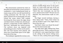





Smartquotes are really important to me. Perhaps it’s just a finicky little thing, but to me they are another little element that makes books look more professional. Whenever I’m creating an eReader e-book, I always smarten the quotes if they’re not smart yet.
My opinion: who cares!
Smart quotes are important to me as well. I’ve even written my own Java program that (among other things) parses various HTML and TXT formats and converts regular quotes to smart quotes (when I get books that don’t have them).
Of course I am a total geek 🙂
But serious, this kind of markup makes any ebook look WAY more professional, IMHO.
Extremely important to me as a reader, an author, and a publisher. Important enough that we spent the time to do it. It’s a polish, a signal that the publisher went an extra step for the customer. It’s conspicuous by its absence.
It is not difficult to do a CTRL+H and replace them with the appropriate markup.
It depends is the basic answer. They do make things look nicer but it rarely seems to be a massive improvement.
The problem, as you hint at, is the likelihood that the ebook creator will be screw up the conversion of these characters because they are not in the basic ASCII set.
If the quotes, mdashes etc are created using portable methods such as HTML entities such as — then I’m going to be happy. My problem is with the use of non-portable versions because the potential for them to not display properly in someone’s ebook reader is high.
At a minimum I think UTF-8 should be mandated as the character set on all ebooks since UTF-8 will also allow foreign characters, accents etc. not all of which have HTML entities. This ought to fix the smart quote issue and if UTF-8 is the mandated minimum everywhere then it becomes easy to troubleshoot who is at fault when the wrong characters are displayed.
What Mariah & FrancisT said.
In recommending a book to a friend? I’d say a “1”.
It does make the book look more professional, and I have the technical know-how to do it myself, but I rarely take the time. Getting consistent character support across book readers is very difficult (although the landscape is improving).
If I were a publisher of ePub or HTML, I wouldn’t include them. (Mobipocket and eReader are horses of a different color, though, because they are such limited platforms that the end result is known ahead of time.) Nothing worse than question marks or the like in place of quotes.
They are important — and publishers are being short-sighted in ignoring them. When I try to get people to share my enthusiasm for ebook reading, many reject the experience at a glance. They can’t articulate WHY they like printed books better; they just know that they DO. But surely one of the reasons they DO is the care with which material is presented on the printed page.
The irony is that small-screen ebook readers often default to (or indeed have no choice but) full justification, which looks awful on narrow line lengths, as if THAT was the heart and soul of good typography, and then give us typewriter quotes and hyphens for em dashes — two if we’re lucky, one if we’re not.
The utter sloppiness with which most books are converted to ebooks is shameful. Yes, yes, yes, sutff like making each footnote into a hyperlink might be labor intensive, but getting the quote marks right shouldn’t be; they were presumably right in the original typesetting files. The slapdash efforts put forth by even some of the biggest commercial publishers in proudcing ebooks are shameful.
I recommend books on their content, not their character set.
But when creating ebooks I always use smart quotes and en or em dashes. Small touches make a lot of difference. I also prefer to create ebooks that don’t indent the first paragraph of a chapter, that have a page break before chapter headings, that have a good table of contents (at the back!) And possibly also include some minor graphical niceties, perhaps in section breaks. And even, perhaps, do something special for the first character/ first words of each chapter.
Most readers will no consciously notice these items. But they do contribute to an overall impression of quality.
Not important at all. I just don’t care. When I’m reading, I don’t notice whether the quotes are smart quotes or not.
I do prefer real dashes and indented paragraphs (if the paragraphs don’t indent I feel like I’m reading a webpage), but again, it’s not really important.
As a reader, no. I don’t care. I’ve read some horribly formatted ebooks in my time, and perhaps that’s contributed to my internal ability to just correct on the fly, so to speak.
I’ve also read professionally edited & formatted books and while they look better, the story is the same whether it’s in arial font or courier.
I’m not saying that authors/editors shouldn’t produce good looking (e)books, just that it won’t sway me when deciding if I like a book or not. I can understand how people feel differently, though.
To me, the message/story/article is what’s most important, not so much how it’s presented.
Hmm, now another thought just popped into my head. (After hitting submit, of course.) 🙂
I also cringe at the way some younger people write today. Perhaps that’s a by-product of not caring about the presentation as much?
I do prefer smart quotes because they do look nicer. As far as dashes go, it’s not a matter of what I prefer, it’s a matter of what the author put in. If the author used em dashes, then I want em dashes in the eBook. When I convert content, I do tent to convent the quotes and apostrophes as needed and I do keep the dashes as the author intended. These little touches make for a nicer looking eBook that gives a better reading experience. If you are finding the formatting is getting in your face, then no matter how good the book is, the reading experience will be lessened.
Curly quotes and proper dashes and ellipses make my reading experience SO much nicer. Like others, I revise any materials I can, such as gutenberg books.
But it would not count the slightest tittle in recommending a book or ebook to another. For that, content is my exclusive consideration.
Smart quotes and all that are great. Love them. Love DRM-free, multi-format eBooks even better.
If not using them makes more books more likely then dump em!
People care? Seriously?
If I’m doing anything with the coding of a book, I take the smart quotes out. It’s first on the list. Dashes, eh, I don’t really care about. But smart quotes tend to annoy me.
As a basis for recommending a book or not, smart quotes are not even a consideration.
I would rather do without smart quotes if that meant I’d never have to see another garbled one. Garbled characters in an e-book drive me crazy. Real dashes are slightly more important, but spaces and hyphens used judiciously are a good substitute. So smart quotes would not make me more likely to recommend an e-book. Not at all.
I don’t care much either way, and tend not to pay attention to them. However, little is more annoying than they get messed up, or one is using a browser/reader that doesn’t support them. For example, the teleread blog entry http://newteleread.com/wordpress/2009/01/17/walt-mossberg-and-the-scrollmotion-fallacy/ appears to be trying to use smart quotes, but what I see is
Yes.
Going by the comments here, it seems more people care than don’t.
I don’t really care either way unless it’s something I’m writing.
One of the first things I do on any wordprocessor (I’m a freelance writer so I normally keep at least half a dozen installed) is turn off smart quotes.
They look great on a properly formatted book– just wonderful. But they look so terrible when they’re messed up that I avoid using them most of the time because they’re such a pain to deal with when you’re changing dialog around.
That being the case, I don’t worry too much if they aren’t there in something I read.
When converting doc/rtf/html/pdf to ASCII text (which I try to do with all my files), removing smart quotes is the first order of business.
Then ‘real’ m-dashes are converted to ‘–‘, per the Project Gutenberg standard.
I get over 70,000 unique visitors a month, and no one has complained about these practices yet.
Besides, smart quotes are not ANSI standard – they’re a Micro$oft aberration, so the less we see of them, the better.
ANSI text is the simplest and most universal form an ebook can take, and is compatible with just about every platform and gadget out there. I don’t believe it will ever be displaced as the format of preference for fiction ebooks. Non-fiction, of course, is another matter.