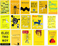
 As you shop for books and e-books online, have you been increasingly seeing yellow? There’s a reason for that.
The Wall Street Journal reports that the reduction of covers to one-inch thumbnails in displays on online retail sites has driven publishers to something akin to desperation to make their books stand out from everyone else’s. Increasingly, the answer to how to do this involves the color yellow.
Any bright color will catch the eye, of course, but yellow has a number of advantages. It’s a gender-neutral color with a variety of potential interpretations—it could signify warmth and happiness, or caution and hazard. It works with both bright and dark colored text and images, so it’s easy to swap in for a white background without having to change much else.
Added up, these factors make yellow book covers even more of a “sudden craze” than Donovan’s “electrical banana”. The only problem is, how do you stand out in a crowd of books all trying to stand out in exactly the same way? Who knows; maybe drab and boring colors will be the “very next phase.”


As the creator of the covers for my books, going yellow, if such be the trend, is stupid. What does make sense is making sure a cover scales down well, looking as good and, if possible, having a readable title, even at the thumbnail size. If that thumbnail looks like no more than a colored splotch, it matters not what color it is.
And by that standard, virtually all the books illustrated with that WSJ article fail. At the thumbnail size, their title can’t be read. Indeed, for some their bright yellow cover can’t conceal the fact that they look like a grade-school student’s concept of a ransom note.
A word of advice to authors in need of a cover who’re uncomfortable doing it themselves. All too many artists are shoved about by fads, more interested in impressing their peers than in giving you a cover that will age well. Fads in covers are like fads in clothes. The more “in” a cover is one year, the more out it will be next year. Such a cover will date your book horribly. Go for a classic look.
You can get an idea of the covers I’ve created over the years below. Some I like. Some I now regard with regret. A few are even yellow. Fortunately, none look like ransom notes.
https://www.behance.net/InklingBooks
–Mike Perry