


Fascinating article (I love typography) by James Felici in CreativePro. I suggest you read the whole thing and take a look at the illustrations as well:
Whether on Kindle, iPad, Nook, or other LCD display, type suffers compared to print. So is good typography even possible for today’s electronic devices? From the standpoint of the craft’s two underlying principles — legibility and readability — the answer is “no.”
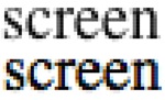
If you look at the size of the type most people choose for their Kindle, iPad, or any other device used for reading e-books, you’ll see that it tends to resemble that in books for people with vision problems. Logical enough, because when you’re reading an e-book — especially on a computer monitor — you do indeed have vision problems, compounded by poorly set type.
Enlarging the text addresses the first problem of screen type: legibility. When set in sizes considered normal for print on paper — 10- and 11-point — it can be a struggle just to decipher screen type. But making type larger by itself — enlarging it to, say, 12- or 14-point — does little to improve readability, because the low resolution and display techniques of computer and e-book reader screens prevent the fine character definition and spacing we’ve become accustomed to in print over the years.
The question of readability is not just an academic or aesthetic issue: Studies show that people read printed text 25 percent faster than on-screen text. What can we as typesetters do about this? Very little, as it turns out.
The concluding paragraphs are an eye-opener:
I am not a Luddite when it comes to onscreen reading, and I can see a day — it could be very soon indeed — when devices with reader-friendly display technologies make e-reading the functional equivalent of reading printed pages. Very high-resolution display devices already exist, although costs keep their sizes so small that they don’t provide a very pleasant or book-like experience (much less a magazine- or newspaper-like one). We can quibble about the aesthetic merits of print on paper, but that’s not the point here.
The problem today is that after 500 years of evolution, the “printed” word has taken a step backward in quality. According to “The New York Times,” electronic publishers are commissioning shorter books because their readers find it too tiring to take on longer works. Ever since I started writing for online magazines I’ve been obliged to write shorter pieces than in the past because editors tell me that online readers simply won’t finish longer articles. With today’s technologies, reading is simply more of a chore than it’s been in the past. Access to reading material is amazingly easy — a revolution, in fact — but reading is more than just taking in information, and the aesthetics of text presentation involves more than just making type pretty. It means making type functional as well.
Thanks to @petermeyers for the link.


An interesting read. But I sense a strong bias from the author. The article reads as if the author’s goal from the first is to show that digital text is inferior to printed text. Blowing up screen text to massive size and mocking it for it’s pixelated look is not really helpful.
I do all of my recreational reading on an ereader. I have for years: every since the Kindle 1. Currently I read from the small Sony 350. It’s tiny, light and can be held in one hand. I’ve never felt that it created any more of a strain on my eyes than a printed book.
In contrast, I now find it quite awkward and unnatural to hold a printed book. It’s heavy, it’s unbalanced and you have to exert force to hold the pages open. And you are generally reading from a curved page that arcs up from the binding.
I don’t believe all the authors sweeping generalities about reading from a screen. Screens come in a multitude of resolutions and sizes. The only thing I agree with is that more resolution will be better.
This really is a piece of utter BS. I have read many many paper books with very strange typography. I have just picked up a few books lying around me here and this article’s point about “operating systems intentionally make type fuzzy using a technique called anti-aliasing, or more popularly, font smoothing” is also utter BS. I can see the ink leaking off the edges of the type into the paper ! FGS! and his nonsense about screen resolution is just that, nonsense in a world of e-ink and retina displays.
“electronic publishers are commissioning shorter books because their readers find it too tiring to take on longer works.”
I would like to know what actual ‘evidence’ there is of this. It makes absolutely NO sense logically. Who reads a complete novel in one go ? ok a very small few. The vast majority of readers read in chunks of maybe an hour at a time spread over days or a couple of weeks. So the overall length of the book is irrelevant.
This smacks of another front in the fetishising of paper, camouflaged under a ‘typography’ label …. ‘give me patience!’
The article seems to miss the point. Very few people read books on their home computer, so the poor quality of that screen matters little. They are reading on digital readers and there the resolution is usually much better. The text on my Kindle 3 is quite sharp and that on my new iPad even better. Except for the cheaper devices, the issue isn’t screen resolution, it’s the fact that ereaders don’t allow an author/publisher to tailor of font to suit a books subject matter. Light, romantic fiction gets the same default font and something dark and somber.
And the variation on that–the users choose their own font–makes no sense. We’ve been publish books for over 500 years and there’s never been a public calling out “I want to choose my own fonts.” Readers want publishers to choose an appropriate font like they want to author to create the plot and words. And ereaders allow very little freedom to do that. One book looks just like another.
Compounding the problem is the rabid selfishness of the major ebook retailers. Amazon’s new KF8 is an adaptation of ePub as is the format created by Apple’s iBooks Author. Why couldn’t they have just gone with epub? The more time and money a publisher has spend creating multiple formats, the less time available for doing any of them well.
That’s why ebook typography is in such bad shape. The issue isn’t screen resolution. It’s the inadequacies of ereader software.
“Very few people read books on their home computer, so the poor quality of that screen matters little.” From what I read recently, quite a sizeable proportion read books on their computer screens. I’m one of them. Compared to a lot of books I’ve come across lately, the screen is a huge improvement. From the cramped text and cheap paper in mass market paperbacks, to a fad (which I hope has now worn itself out) of grey rather than solid black type, print is often the inferior choice.
Who are the big six hurting? The authors! If statistics are correct, more and more people are turning to digital readers, phones, or tablets and more people are reading; good for everyone.
With the digital age upon us, companies must develop digital know-how or face whatever costs the distributors charge. Not fair, but what is.
This author has never taken a look at the typography of the hundreds of print books on my bookshelves. The font size is tiny and cramped, the font choice is boring, the resolution is not so hot and a bit fuzzy in some cases, printed on yellowing dry cracked paper.
Granted, as a reader on a budget when I bought most of these editions, they were cheap paperback editions. I didn’t really notice how bad it was back then because I was emersed in the story.
Now when I look at them, I wonder how I ever managed. The resolution on my e-ink screen is so much better than those old faded paper editions. I can increase the font size when I am suffering from a headache. I can change the font to one I am more comfortable reading (I don’t really need my font to match the content because when I am reading I am out of the moment – but I prefer it to be a font I am comfortable reading).
I do appreciate the value of a nice hardcover printed on quality paper stock with a nice typeface that is both easy to read and fitting to the content – but for the most part, I don’t need it and I hardly ever would pay for that. Save that for those rare finds that I want to treasure. For everything else, my e-reader does way better than my paperbacks ever did.
Michael wrote:
“And the variation on that–the users choose their own font–makes no sense. We’ve been publish books for over 500 years and there’s never been a public calling out “I want to choose my own fonts.””
Michael that surely is a bit silly. How could they make that demand ? Really 🙂
“Readers want publishers to choose an appropriate font like they want to author to create the plot and words. And ereaders allow very little freedom to do that. One book looks just like another.”
I disagree. I chose my own font in my eReader software as well as it’s size and colour. I just read a historical title and chose to read it in Georgia. I was able to set each title’s own font. I also browse the web with browsers all of which can change standard fonts. When I visit friends houses I often notice that they prefer different fonts for their reading online. My nephew uses some crazy robotic font … yuk.
Readers do indeed want to, and do, chose their own fonts.
…is Felici aware that you can’t change the font size in printed books?
Or, to put it in the terms he prefers, printed books are manufacturer-crippled devices that use a locked-down format which won’t let the user change the font size.
Also: “electronic publishers are commissioning shorter books…”
The reason for that is that the typical ebook buyer would prefer to buy six 200-page books at $2 each than one 1200-page book for $9.
In other words, they’d rather spend more money a bit at a time than less money all at once.
DD – are they actually “commissioning shorter books” though ? or has someone heard of ‘one’ publisher doing so ? or … is there a resurgence in interest in short stories because they can be packaged and sold individually in digital form in a much more efficient way that in paper form…? A VERY different situation that suggested by Felici
If you pay close attention to the number of pages listed for most current novels in print form, most of them come in right around the 300 page mark, give or take a few pages. A lot of this has to do with the printed book being divided into signatures and wanting a book to stay within these limits. In other words, you wouldn’t want the book to run, say, two pages into a new signature and then have the rest as blank pages.
E-books are not constricted in that way since they don’t have to divide into preconceived spaces. So a story can end when it ends which has to be a nice thing for the creative mind. I do love a nice long book myself.
I’ve been delighted to see the resurgence of the short story and novella in ebooks. A story is its own length, not some arbitrary length set by publishers to suit paper-publishing machines.
There are plenty of autobiographical notes from authors in the pre-digital age, of being told to “throw in another corpse or two” or “cut out a couple of chapters” to fit the required paper-publishing length. Ebooks liberate us from those artificial limitations, and provide us with stories of different lengths, for a range of purposes.