 Yes it is cool. From Electric Literature:
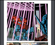
Our single sentence animation for Lynne Tillman’s “The Original Impulse,” featured in Electric Literature No. 5, may haunt your dreams. (Animation by Monica Garrison and music by Andrei Pohorelsky.)
The sentence: “She roared here and soared there, dwarfed by three massive white columns as she and her best college friend mugged before a filmless camera.”
For some reason the embed code won’t work, but you can watch it here.










How dreadful! A minute and a half of video to offer readers about five seconds worth of text. This is even worse than those awful writers who can’t just say a character drank coffee. They have to go into infinite detail about the brand, how the water was heated, how it was brewed, and how the steam rose up from the cup. I suspect there are writer’s seminars that teach would-be writers that sort of thing.
This is that only worse. The constantly flashing and changing images are just a distraction. And what’s the point of all those oddly lit beams of wood? When I read, I want to good content with style, plot and movement. I don’t want to look at constantly changing pictures like a baby in a crib giggling at a spinning toy mobile.
Digital books are going through the same silliness the web went through circa 1995. I remember it well. Browser developers (Microsoft and Netscape) thought they were catering to public demand when they added features like flashing marque text and crawling ants borders. The public not only didn’t like it. They hated it and those browser features died a merciful death, replaced by the simple italics and bold you see today. We even use browser plug-ins like Clicktoflash to turn off their modern equivalents, those loud, blaring ‘look at me’ Flash ads.
I long for the day when we can put all this silliness behind us and digital publications will be attractive and professional rather that look like something designed for a toddler on a sugar high.
–Michael W. Perry, Seattle
P.S. Please excuse my frustration. I’m laying out a Kindle book and am less that happy that Kindle_Gen insists on changing lines of unindented poetry into heavily indented text, forcing a lot of ugly line wraps. I shouldn’t complain At least the Kindle’s epaper screen spares us from the glitzy stuff you might see on an iPad.