 Well, yes, the above headline might be a little over the top.
But having just tried the Times Reader for desktops, laptops and tablets, I wonder if we’re really talking Generation Gap here.
Here’s the problem. The New York Times—actually I should say “Microsoft”—has done a slick-looking reader that is nicely reflowable when it comes to juggling around article-sized units. No left-to-right scrolling! The Reader’s look might delight people over 35 or 40. But many Web-wearned young surfers, and even antiques like me, won’t be so ecstatic. Why? Because:
1. Even on a desktop running at around three gigahertz, the Reader is slower than it should be. Yes, this is a beta. But since the reader is usable offline, I was hoping that clicked-on articles would appear instantly, working from a cache. No such luck, despite the stored files. Maybe this is because the Reader is still in beta. Perhaps the B word also explains why the Reader needed at least 50 seconds on my system from boot-up to the display of the reconstituted front page of the Times.
2. While the final version of the Reader may end the software‘s speed problems, it won’t do away with a design-related delay that this human suffers. My dream news reading software would show me a bunch of headlines in one swoop, rather than forcing me to scan across my screen.
More on Reason Two
Scanning, unfortunately, is just what the Reader forces me to do in taking in little news summaries and headlines.
It’s not the best use of my time. While the Times perhaps wants a “realistic” graphical interface to please older readers, I suspect that many of the younger readers will feel the same as I do.
What’s more, this actually is a long way from the real New York Times layout; the newspaper is merely juggling little bite-sized chunks of text, except for the featured stories. For the minor stories, you still don’t get the best feel for the most important.
Instead of the dino approach, the Times would have been better off with the philosophy evident in the newspaper’s beautifully crafted mobile site for readers with cellphones, PDAs and the like.
The glories of mobile.nytimes.com
Come to think of it, even in real time, news stories come up faster on my little PDA, using mobile.nytimes.com via the Web and my cable modem/WiFi setup, than on my desktop with the Times software.
On my little Palm TX, I can see a bunch of headlines in a hurry, starting with the ones that the Times has ranked high on the home page—thereby giving the newspaper a chance to exercise some news judgment.
I think it actually would be cool to let the readers choose between the latest stories and those deemed most important within the past 24 hours. A cooke-based toggle? Oh, what you could do to make the mobile site even better!
Now, I’m not saying a desktop reading program should use an approach as spartan as the cellphone/PDA one on the mobile site. It definitely should run graphics and a photo or two or various icons to spruce up the home page, and I wouldn’t mind some text summarizing the articles. Even the mobile site offers article summaries on the home main page.
Away with the bloat!
But, please, do not try to give me a bloated cross between an old-fashioned newspaper and an electronic one.
Go for the big time–electronic–and make the Times viewable on my PC in both stored form (via special software) and in real time (via the aforementioned software and a regular browser).
Even some of the older people for whom the Times went post-modern, so to speak, might actually appreciate the above approach. The slimmer the core presentation—without all the efforts to imitate a paper-style appearance—the more opportunities for the Times even to sneak in graphics touting multimedia links.
Inevitable: I take it for granted that some precocious 11 year old will write in and say, “Who says this is an age thing? I love the looks of the Times Reader.” So be it. I’m recklessly generalizing.
Related: Vin Crosbie‘s essay on The Digital Edition Dirigibles. Vin is an old news hand—a former Reuters and UPI exec and a fifth-generation newspaper guy–who has been on the Net forever.
Reminder: I’m among the ringleaders behind the XML/CSS-based OpenReader standard, and our first implementer, dotReader, could be a rival of the Times Reader.







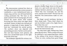








It’s not so much about age. This experience is about reading more than scanning. If that’s somehow an “older” person thing than… OK reading is for old people then. The busy / helter skelter pages of most news portals today are designed to entice ad clicks in a medium that doesn’t permit much else in the way of design. People flit from site to site. Ads are presented and pop up at you. Click, scroll, hunt, click, wait, click, dismiss ad, click, wait, scroll, scroll, scroll…
This is a different type of experience that presents a package of news in a designed format. You can follow a kind of narrative from one end to the other via simple navigation with a keyboard or mouse. You don’t have to devote your energy to finding, scrolling and clicking. You can instead focus on just consuming, reading. If you happen to have a touchscreen, navigation is a simple as flicking your hand across the screen.
And user studies we’ve done suggest that users strongly prefer content in this layout (paginated, columns, etc) than in traditional Web layout.
But I do agree this is not a replacement for newsportals or blogs. Those things have their place.
Perf isn’t that great on lower end machines. It’s pretty good though on most hardware selling today – even the smaller tablets and laptops.
Btw, did you try the Topic Explorer? Curious what you think of that kind of experience.
Hi, Kevin–here are my thoughts.
> And user studies we’ve done
“We’ve”? Kevin, if that means you’re part of the Reader team, I’d especially love to hear further thoughts from you on why the Reader turned out as it did. Thanks. Actually I can recall your earlier insidery comments in the past. I hope you find my feedback helpful.
>It’s not so much about age. This experience is about reading more than scanning. If that’s somehow an “older” person thing than… OK reading is for old people then.
Scanning is for everyone. Few people have time to read the whole paper. Do you actually plow through the entire NYT each day? I myself zero in on the articles of most interest. To use a Bill Hillism, I love immersive reading, but I just don’t have time to lavish my full attention on everything.
> The busy / helter skelter pages of most news portals today are designed to entice ad clicks in a medium that doesn’t permit much else in the way of design. People flit from site to site. Ads are presented and pop up at you. Click, scroll, hunt, click, wait, click, dismiss ad, click, wait, scroll, scroll, scroll…
Hear, hear about your concerns, Kevin! But even with a PDA, I am giving the Times far more attention than with a typical newspaper site, including the Washington Post, just across the Potomac from me. A big reason is the wonderful Mobile option at mobile.nytimes.com–sponsored, I might add, by Windows Mobile. No prejudice against Microsoft, then. I can laze back in an easy chair instead of having to spend yet more time in front of my desktop. Yes, it would be nice to own a tablet, but even if I did, I’d prefer the arrangement I’ve described in the post above. The current Reader is still too much like a newspaper and not optimized sufficiently for display on a computer.
> This is a different type of experience that presents a package of news in a designed format. You can follow a kind of narrative from one end to the other via simple navigation with a keyboard or mouse. You don’t have to devote your energy to finding, scrolling and clicking. You can instead focus on just consuming, reading. If you happen to have a touchscreen, navigation is a simple as flicking your hand across the screen.
But it isn’t as if a graphical approach does away with the need to click. You’re just clicking on something different. What’s more, nongraphical approaches also can use dual columns.
> And user studies we’ve done suggest that users strongly prefer content in this layout (paginated, columns, etc) than in traditional Web layout.
See above. i don’t think this is limited to a graphical approach. You could detect the browers, screen stats, etc., and adjust.
> But I do agree this is not a replacement for newsportals or blogs. Those things have their place.
Exactly. And the Times software might as well. Best of luck with the product. It’s just that I’m not sure if it’s right for me. We’ll see. If nothing else, i do enjoy the novelty of the experience. But that’s not the same as committing to the Times Reader forever. All I can say is that I’d like it better if it used a different design philosphy. You could still make things rather attractive.
> Perf isn’t that great on lower end machines. It’s pretty good though on most hardware selling today – even the smaller tablets and laptops.
May the speed on other hardware be better than what I encountered. I’m usuing neither the faster nor the slowest machine.
> Btw, did you try the Topic Explorer? Curious what you think of that kind of experience.
Great question. I tried it just now but prefer the relevance display. Even better, would be a text-oriented outline option.
BTW, I do applaud Microsoft for experimenting with the display of search-generated items. I just think that for the moment, places such as Vivisimo do it better.
Thanks,
David
Thanks for your thoughtful reply. I guess we disagree. As this evolves, it’ll be interesting to see how readers respond.
Btw, did you mean “insidiary” in reference to my previous comments? I re-read my comments and I don’t see a lot of heat in them but if that was your impression, know that it was unintentional on my end.
Thanks for being a good sport, Kevin; I certainly think you’ve been most civil. Just so you’ll know, the word was “insidery”—as in “characteristic of an insider.” It’s an neologism that some of us media types have used. See an example here or here or here (last one might be available only to paying NYT subscribers). Hang around. Who knows, I may yet grow to like certain elements of the Reader. Best of luck with it, in any event! II’m delighted you stopped by. David