 On Mad Genius Club today, Cedar Sanderson is talking about formatting paperback book covers. Most of the post isn’t germane to e-books, but she does begin with this provocative tidbit:
You know what the problem is with ebooks? They’re spineless, that’s what. Nothing to look at on the shelf, they just disappear when they aren’t wanted into the Kindle or what-have-you until they are summoned again. But some people like a spine, and others judge books by the size of their spine. For them we want to create a paper book[…]
It’s an interesting observation. Of course, from a paper book lover’s point of view, I’m sure there are plenty of problems with e-books, not just spines, but the matter of a missing spine (and, for that matter, a whole missing cover) is rather endemic to the whole idea of e-books. It’s related but not identical to the problem of missing physical covers not letting other people see what you’re reading.
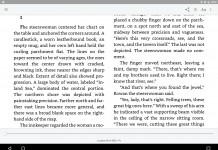
A lot of e-readers, such as iBooks or Classics, get around this by displaying e-books not as mere lists of titles but as skeuomorphic “bookshelves” with books arranged on them with their covers facing outward.
Of course, this looks a bit silly given that, in the real world, people put books on shelves with their spines out—but, again, e-books don’t have spines. Literally—the e-book file specifications include cover art, but they don’t include spine art that could be used to make a skeuomorphic display representing the way the spines would actually look. So e-readers just make do with what they have, and readers end up with a choice between shelves full of outward-spaced books (which, apart from looking silly, doesn’t list as many books on one screen as would be possible with spines) or sterile lists of author/title (which doesn’t have the same kind of at-a-glance differentiation as a shelf full of spines).
I wonder if a future edition of the EPUB spec might include a specification for spine art, to make possible more “realistic” bookshelf displays? Not that it would really matter, I suppose, because Amazon wouldn’t, and publishers probably wouldn’t be interested in the extra work of going back and adding an additional image to the thousands upon thousands of e-books they’ve already published anyway. Kind of a pity no one thought of this when e-books were new, isn’t it?


I’m not one of those people who long for the smell of real paper, but I did miss the visual impact of looking at books’ cover art as I pulled them from the shelf.
So I’ve copied my entire Calibre library to a memory card, deleted the .epub and .mobi files to leave just the cover.jpg files, then plugged the card into a cheap digital picture frame. Now I have a slide-show of my library cover art running right next to my favorite reading chair.
It drives me crazy, though, that so many ebooks are issued with black-and-white versions of the cover art or, worse, a generic publisher graphic. To me, that’s more egregious than a missing spine image.
(Calibre allows you to download proper cover images from Amazon, Google, & other locations, but it’s a lot of work if you don’t keep up with it every time you add a book.)
I have long wondered who still bought paper books. Evidently, it is people who like spines, or judge a book by the size of the spine.
So now I know. Paper book buyers are predominately orthopedic surgeons.
I devote quite a bit of time to getting my front and back covers right, so that is why I regard “Get a Spine” as misguided. There are few parts of a book less important than the spine. Even the copyright page has legal importance.
You can’t do much with a spine that’s typically less than a half-inch wide. At best, you can only create one that doesn’t make the entire book—opened up and lying on a table—not look bad. For that, the spine’s color has to blend well with the colors on the front and back covers. And that, in turn, means those covers need to be designed with the spine in mind. That’s one reason I chose a sunset red theme for Lily’s Ride:
http://inklingbooks.prosite.com/221883/3271857/gallery/lilys-ride
That allowed me to use a red spine. Any other color, even black, would have been gauche. The only other real requirement of a spine is that it be easily legible when placed in shelves. It didn’t hurt that Lily’s bold night ride is to prevent her father from being captured by the Klan, tied to the middle of a bridge and burned to death. Good covers often work on multiple levels.
The spine exists so a book can be found. The fact that ebooks don’t have spines matters little. In an ereader, you can read the title from a scrolling list or search for it. The author is right that ebooks are invisible when not being read. But that’s because they have no physical existence not because they lack a spine.
Then again, I am a rebel. The current fad in independently published books seems to be covers that have:
1. A cluttered design,
2. Washed out colors, and
3. A theme that says little about a book’s contents.
You can tell from the other two of my most recent books, I don’t do that. I keep the design simple, usually carefully selected stock photos. I choose a contrast between between the front and back covers to get across clearly the book’s content. For this book:
http://inklingbooks.prosite.com/221883/2467804/gallery/my-nights-with-leukemia
The contrast is between a lovely little girl before she got leukemia and what she looked like at the height of her chemotherapy. And yes, that is the same girl front and back. I spent many hours looking for just those photos.
There is also:
http://inklingbooks.prosite.com/221883/2467790/gallery/hospital-gowns-and-other-embarrrassments
I went back and forth over whether the cover of that one should have an older or younger teen, since a book with one might not sell as well to the other. My solution was an older teen on the front and a younger one, with a nurse (actually the girl’s mother) on the back.
—–
A central theme of my almost-out book is that hospitals need a mature, talented nurse in a position called a Senior Nurse Mentor whose job includes protecting new nurses from being bullied either by other nurses or by the hospital administration. (A practice know as “Nurses eating their own.”) That is why the front cover is a mature, confident, capable nurse smiling at the photographer and obvious in charge. In contrast, the back cover is a much younger nurse so shy she’s peeking out at the camera from around a corner. The nurse on the front is a ‘big sister’ to the one on the back.
Even better, because both pictures were light and bright, the color pattern for both blended well together and with an all-white spine. The light coloration also allowed me to use easily read black text. That I like. The book should be on Amazon in a week or so.
Almost illegible text is another of my gripes about many of today’s author or friend-designed covers. That makes little sense, when what most buyers will see is a 1/3-size version of the cover online. If anything, what a cover looks like reduced to Amazon’s display-page size matters most. Always see what your covers look like at that size.
In addition, I work hard to create a cover that readers will be proud to been seen carrying about. And it is that inability to be seen carrying a particular book with cover that’s one of the largest emotional losses with digital books. The loss of a spine in a digital book matters little. The loss of an always-visible cover matters a lot.
–Michael W. Perry, Inkling Books
I tend to take care of cover art and metadata every time I add a book, right before I recompile it to left-justify it and such. If I add several books at once, I can just select them all and choose a bulk download and it usually works fine.
[…] of the discussion about e-books and spines a few days ago, this post on imgur.com displays a hardcover book spine design that’s nothing […]