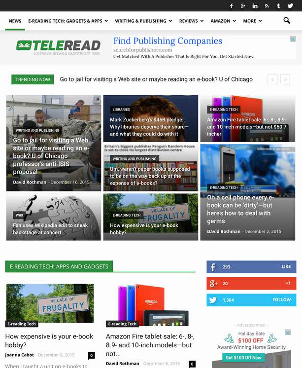
 TeleRead, the Web’s oldest site devoted to general interest news and views on e-book-related matters, is getting a major face lift.
We’re eager for suggestions and other feedback (we know about current speed issues).
Check out the desktop, cell phone and tablet views of new.teleread.com, which will move to teleread.com around January 3. Until then, please keep using the present site.
The new one will offer a more magazine-like look. Notice—how much more graphical we’ll be? At the same time, we aren’t dumbing down. Our writers will still be able to write as long as stories require.
Our comments sidebar will vanish. The “rail” will now make you aware of stories you may have missed. In place of the rail, you’ll see an entire community page with the same threaded approach that our sidebar now uses.
We’re making other changes. Instead of hundreds of categories, TeleRead will include just a tiny fraction of that number. Present plans are for E-reading Tech: Gadgets and Apps, Writing & Publishing, Book Reviews, Amazon, Self-Publishers: News & Tips, Libraries, and Copyright & Other Legal. We’ll continue to augment the categories with more specific tags.
So what do you think? And in what directions should we go, in terms of topics we cover? I myself would like to see more book reviews, especially in areas such as sci-fi and fantasy, thrillers and literary fiction, along with well-done nonfiction of interest to TeleRead community members. We may in time start book clubs.
For the moment, we’re aware that the new site needs a little more work. Suggest tweaks. We already plan to improve our images, and, of course, we’ll speed the site up with caching and in other ways.
In addition, we’ll straighten out the logo, so the tagline reads: For lovers of books and gadgets. Est. 1995. Actually that’s on the conservative side. TeleRead in one form or another is even older. As I’ve written, “the TeleRead.org domain was created in May 1997. Before that, TeleRead existed with updates on the old Clark.net without a separate domain.”
Meanwhile, thanks to our talented Web designer, Joshua Morley, for all the thought and the hard work he put into the design. As owner-publisher I myself offered detailed suggestions—TeleRead staffers did, too—but Josh is the real hero of the day. Within the e-book news and views niche, Josh will continue working exclusively for TeleRead, but if you’re not a competitor, think about using him. We couldn’t be happier with Josh’s services.
If you would enjoy writing about e-books and related technology for our spiffy new site, why not e-mail TeleRead Editor Chris Meadows (robotech.master@gmail.com), with a cc to me (davidrothman@pobox.com)? No pay, alas. We’re focusing now on compensating our long-time staff writers. If nothing else, however, this is a place to write out of passion on topics dear to us such as DRM and digital divide issues.
By contrast, we’ll ignore pitches from writers paid by clients eager for free space on TeleRead. Instead companies can reach me directly about advertising or our sponsored content plan.
All right—the comments area is now open.












I’m loving the new look, David, and looking forward to the switchover.
@Bridget: Thanks. Your words mean plenty—coming from an editorial pro. I’ll look forward to additional thoughts from TeleRead community members. What do people like the most, and what might be better?
Lose the test over the photos, it maybe be alright to have a HUD in an aircraft but you want it to be easy for people to read–i.e. the Trending Now. Make the thumbnails smaller put the text under/over the top and upon mouse over put a shadow box around it.
Just because something can be done does not mean it should be.
Good luck. May this be a lot smoother than the last time.
@GBM: Thanks for your good wishes—and for your candid thoughts. We’ll see how others react to the text/photo arrangements in the panels. Of course, this is a justification for the Trending Now: there’s more than one way to absorb the information.
I do love the design, but one problem I see is that the mosaic will be an issue. If someone drills down to a category page and selects random, the older images might not fit.
Have you worked out a solution to fix that?
I love how your sidebar is now going to be three category widgets, but if I can make a suggestion: can you make the category labels clickable, and take me to the category pages?
I think people might like the option of drilling down.
And as I said, I love the design. It’s much more ambitious than my planned makeover.
@Nate: Best of luck with your own makeover! Yes, on occasion there may be image-fit issues, but the tradeoffs are easily worth it even if we can’t find a solution (although ideally there will be one). You are right about the labels in the three category widgets. It would help to go to the category pages when they were clicked. The category labels associated with the images, however, are clickable.
The new design looks very slick. Is it built on top of WordPress? Can the Google search bot traverse the new design properly? Which other websites are using the design? Who coded the design? Those are the types of questions I would ask before revamping a popular website.
@Garson: Thanks, and not to worry. Our new site runs on WordPress and will be a lot more Google-friendly than the current one. I won’t go into all the details. But the bottom line is that this should help, not hurt, TeleRead’s sustainability.
I like the new design. It looks fresh and modern and more spacey. However, even if I understand it, there are those ads which distract readers’ attention.
One comment: the article view contains so many non-textual elements (like that strange disclaimer on top of the article in http://www.teleread.com/amazon-fire-tablet-sale-6-8-8-9-and-10-inch-models-but-not-50-7-incher/ that it is difficult to visually separate text to be read from the other page parts.
There is still room for improvements, fortunately.
@Martin: Thanks so much for your feedback, and I’m glad you like the design as a whole.
Unfortunately, we need the ads to pay TeleRead’s writers.
People just don’t donate meaningful amounts to e-book sites—here are the sorry results for another site—and we’d rather not charge.
At the same time we intend to try an alternative, honestly labelled sponsored content with information useful or entertaining to TeleRead community members. The article you saw about the Amazon tablet was a page experimentally labeled for sponsored content even though the post was a regular post.
I’ve now tweaked the page to let people know what is going on. Along the way, I saw that Google ads were also appearing between the headline and the text. In the future, we may switch ads off from sponsored-content pages and perhaps also get rid of the social media icons, at least from the present location above the text. That will at least partly address one of your concerns.
Keep the feedback coming!
Thanks,
David
Addendum: My current thinking is to leave in the social media icons so people can more easily share the sponsored content. There might also be ads off to the side. But I currently hope we can get rid of the ads between the headline and body of the text on sponsored content pages.
Sigh! I am so sick of the mindless turn to “magazine” view. Sorry to argue, but it *is* dumbing down. The idea that every single article has to be accompanied (or should I say “dominated”) by a graphic. For the people that have a hard time with text, we’re gonna give you pretty pictures. For those who have a hard time visually picking out the textfrom the background, or just hate scouring through a bunch of distracting graphics to find the articles they want to read, well, you’re probably mouth-breating landline holdouts who refuse to go forward with the times. Yeah, so I think the new design sucks. Period.
What do you mean, “magazine view”, Catana? Are you referring to the front page? The article pages don’t have a radically different design.
@Catana and @Nate: As noted, our posts will be just as much as ever in depth. Other than images off to the side promoting other articles, we are not adding that many photos to individual posts. Nate is right. In that respect, the design of the “inside” pages is essentially the same. Furthermore, please note that many distinguished publications on the web, such as the theatlantic.com, use graphics extensively, especially on the homepages. Maybe part of this is generational, Catana. Even bright young people today seem to respond better to a mix of text and graphics than to text alone, and your “behind the times” reference just might suggest your alleging the same. Anyway, thanks for sharing your honest opinion, and I hope you stick around.
While I don’t mind the overall layout, I’d prefer not having to scroll down to find the “Latest Articles” area. Will there be a direct link to this module?
@David Rothman Yes, I was speaking of the home page, obviously. I didn’t even imply that there would be less depth in the articles, merely that accessing them will now be a matter of hunting through graphic boxes that aren’t always friendly to the headline text. “Bright young people” respond better to the mix because they’re been brought up in the visual environment of tv and movies. So are they responding to the visual cues rather than the actual headlines? In other words, are they responding to pretty pictures rather than meaning? It’s a generational thing, no question, and a disturbing one, considering the uptick in badly written news articles and how seldom anyone comments on that decline.
I’m well aware that The Atlantic and most news sites have gone the graphic route. That’s neither an improvement, nor a justification for Teleread.
@ Catana
Here’s the thing no one says outside of sites where publishers congregate: a homepage like the one that David is adding to Teleread is one detail which distinguishes personal blogs and legit serious websites. Blogs show a stream of posts on their homepage while legit sites have a custom homepage.
I can’t speak for David, but I’ve been told by no less than three people that I would be taken more seriously if I had a homepage.
And we do want to do everything we can within reason to fine-tune the design so that it works the best for the greatest number of people. If you’re finding the text is too hard to see and words get lost, please give us some suggestions for how to improve it and we’ll take them seriously. (Suggestions other than “dump the whole design,” that is.) We can’t please everybody, but we can try to come as close as we can.
@Catana: If even images off to the side are too much to handle, you could use either an iPad or something else with the ability to strip away everything but text. That’s exactly what the iPad’s mobile Safi Web browser can do.
Another strategy would be to read our email or RSS edition—they’re not that graphical.
Meanwhile I agree with both Nate and Chris.
People, including advertisers, will take the site (even) more seriously if it looks less bloggy.
Furthermore, as Chris says, we’re trying to please many people. I readily accept the fact that we can’t absolutely delight everyone. But we will do the best we can.
Thanks again for your candid thoughts.
“In addition, we’ll straighten out the logo, so the tagline reads: For lovers of books and gadgets.”
Good! That’s much better than the current one: “For geeks who love books and booklovers who love gadgets.” The old slogan implies that a love for gadgets and a love for books are somehow incompatible.