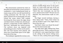
 Mantano Ebook Reader Free is my EPUB ebook reader of choice, and I know I’m not the only one. David Rothman and Juli Monroe are both fans as well. So I greeted a new upgrade via the Google Play Store last night with eager anticipation. For one thing, it brought a striking – and to my taste, rather garish – new icon, in lurid pink. But the new version, 4.2, doesn’t seem to have brought a whole lot of changes behind the new branding, at least for the free/ad-supported version. It does seem to have brought a bunch of complaints, though.
Many users are already reporting that their app won’t open after the upgrade. If Mantano is your preferred ereading app, that can be crippling. A pity, because aside from the logo change, there do seem to be some solid fixes and improvements, especially in the Premium version, where an EPUB3 global progress indicator and progress bar has been introduced, as well as a global fix to the OPDS Catalogs. This kind of upgrade flub can be a major annoyance, and I hope Mantano pushes out a further upgrade to fix it soon.
Mantano has in fact had full EPUB3 support in its Premium version since November 2015 – just one of the reasons I favor it. But you’ll only get to know that from the Mantano Desk support site. The main Mantano site hasn’t had a news update since 2013. And it also still carries the old logo, which seems to be lingering around some pages on the Google Play Store as well. Right now, I’d love to know whether the new logo signals some big new corporate plans, or a major rebranding that goes more than skin deep. A new strategy, perhaps? But Mantano isn’t telling. So what’s going on there? I’ll let you know if I find out. Meanwhile, think before you upgrade.


