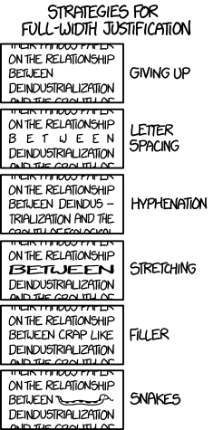
 Today’s xkcd strip is hilarious, all the more so because it lampshades one of the biggest annoyances I’ve had with e-books. I am annoyed, not without justification, with full justification.
The thing about full justification is that it’s theoretically supposed to make it easier to read stuff when your eye can tell that everything begins at the same width and ends at the same width. And in printed books, where the margins are fairly wide and the typesetters have full control over hyphenation and kerning, it works fine. Take any book off your shelf and open it, and the odds are very good you won’t even notice some lines have fewer characters than others.
With e-books, it’s not so simple, for a number of reasons. Most e-reading apps simply can’t kern line by line, which means the only tool they’re left with is adjusting spaces between the words. And since screens are frequently smaller than the printed page—or at least narrower—there’s less room to average out the gaps left by really long words. (Though it’s not as much of a problem on the iPad Mini, with its wider portrait screen.)
It usually ends up with some lines that have really huge gaps between words, which looks awkward and always pulls me out of the story. I end up turning justification off when the app I’m using lets me, or using Calibre to recompile e-books I download to turn off full justification when I can’t. I’d rather have a ragged right margin than all those rivers of whitespace in the middle of what I’m reading.
As xkcd demonstrates, there isn’t any really good way to do full justification with narrow screens. The strip takes an extreme example by using a narrow column and a really long word in the next line, but I’ve seen justification by letter spacing show up in magazines such as TV Guide that had articles with narrow columns and occasional long words. Hyphenation helps, but sometimes even that can be distracting.
Given how often real-life coders take inspiration from xkcd, I’m waiting for someone to write an e-reading app that implements full justification using variable-length snakes. I’m sure it will happen. Who knows, it might even be useful.








E-books need to break free of the legacy of paper books and give up on justification. We know from reading online that justification isn’t relevant. For an ironic view: your post above is rag-right.
I always thought that rag-right improved reading speed by giving your eyes more to latch on to to maintain line position…
And I remember reading somewhere that ragged-right text improves reading speed precisely because the spaces between words are equal. Either way, Wikipedia points out that full justification became the default in print because *it looks prettier*. And having done a bit of digital typesetting myself, I’d say that’s the only advantage — and ragged right doesn’t actually look that bad either, especially if you generously apply hyphenation.
But as Chris points out in the OP, when you’re typesetting a document for print, you can afford to apply advanced justification techniques. When doing it on the fly for a website or an e-book… not so much.
And yet, for some reason, ragged right in a ebook pulls me right out of the story. It doesn’t bother me on web content, but I just can’t deal with it in ebooks. Although, I do read on an iPad Mini, which helps. Even on my iPhone, though, I prefer full justification. If a published ebook forces ragged right, I run it through Calibre to force full justification.
Here’s hoping Calibre adds a snake option in a future update. 😉
I have snake-justification working nicely in the latest test build of Freda (for Windows 10). Expect this to appear as a Store update within the next few days.
You may very well have just won the Internet. 🙂
The Freda update is live now in the Store at https://www.microsoft.com/store/apps/9wzdncrfj43b
For best results, use the ‘settings’ screen to switch ‘hyphenation’ to ‘no’, ‘use snakes’ to ‘yes’, and choose a large font size (33 or so). Then pick a book with long words, and read it in a narrow window.
Trying it, but still not seeing any snakes. Do I have to set justification to some particular setting, too?
It will only produce snakes with justified text (which you can get either by using content that is justified because of the CSS, or by setting ‘force alignment’ to ”justified’. Snakes will only appear in the circumstances shown in the cartoon – a justified line containing only one word (not at the end of a paragraph).
Also check on the ‘support’ option (main sceen, hamburger menu) that the version number is 4.13. You might still be on v4.12 (which has no snakes) if the Microsoft Store update is still working its way through to you.
I dislike ragged right and block style paragraphs. There are a few books I’ve declined to purchase because of a ragged right format in the sample. In a case or two I’ve used Calibre to fix books with ragged right; block style paragraphs can also be fix, but it eliminates intended extra spaces. For the most part, full justification works well on my Kindle Voyage or iPad Air.
XKCD is lampshading? That’s a new one on me. I wonder: Did autocorrect/complete mistake lampoon?
I suppose it’s an arguable use of the word. I was using it in the sense of “intentionally calls attention to something absurd.”