 A comment on a recent post comparing Kindle 2 and Kindle 3 screens noted that the near-black background of the graphite version caused the background on the Kindle 3’s screen to seem brighter, though it was actually exactly the same.
However, it turns out that the Kindle 3 is also available in a white model, and Andrys Basten at A Kindle World has posted a head-to-head comparison photo of both devices showing a screensaver, as well as pictures of the Kindle 3 by itself displaying the New York Times. These photos make it a lot easier to judge the Kindle 3 against the Kindle 2 without the different case colors complicating things.
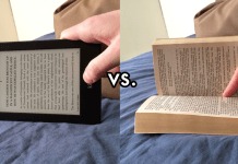
It is clear from the photo that the Kindle 3 has significantly better contrast than the 2, though I kind of wish Andrys had posted some more comparisons, depicting how text looked on both screens next to each other.
I found the comparison via a post by Tim Carmody at Wired’s Gadget Lab blog. Carmody also talks about a few of the interesting tips he worked out from the photos of the Times, and some of the annoying things the Kindle’s web browser can’t do.












My Kindle 3 arrived yesterday. It’s remarkable the improvements Amazon has made. I use both the Kindle 2 and Kobo on a daily basis, swapping from one to the other depending on the content at hand (and, occasionally, reading the same novel on each just to experience the differences).
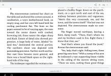
The Kindle 3 contrast is striking — I was expecting incremental but its more than that. And while the screen size is the same, the “real estate” is larger because the top bar with the title has been removed and the text is allowed to fill the screen — it results in extra lines.
The font controls are improved: more sizes, a choice of serif and sans serif; and a “condensed serif ” mode which allows for a larger font without sacrificing words per line. You can adjust the line spacing as well.
Finally the form factor: Kobo and Kindle 3 are the same size; the Kindle is slightly thinner. In its lighted case, the Kindle 3 now feels like a paperback vs the Kindle 2 which felt like a trade edition.
All these things add up to a significant advance.
(Plus, the wifi only unit is pretty speedy — relatively speaking — in browser mode and has a number of useful options to make casual browsing credible vs the tedious 3G browser of Kindle 2.)
Bravo, Amazon!
Chris,
Thanks. I have more comparisons coming, including the fonts though it’s important to show them at the same time together, so it’s harder to get close up. I’ll use a tripod and show them together and then close up within the same time frame and same camera settings…
Chris, I did ultimately do a text close-up of the white Kindle next to my DX Graphite one and it shows how I changed the text size, width, and line spacing to get it more equivalent to the look of the DX Graphite.
That’s at http://bit.ly/k3tips2-dxg
– Andrys
Chris, Okay, here’s a photo of the white K3 model’s text against the much more challenging comparison with the DX Graphite (a Pearl screen with higher contrast as well as well, and the darker border which is known to enhance or give an illusion of a higher contrast display).
I mentioned this yesterday. Here’s a close-up of how the text compares between the two models, the larger one bordered by a dark color and both using the new Pearl technology.
http://bit.ly/k3-dxg-text
I have a Kindle 2 U.S. which, I’ve found, has less screen contrast than the newer Kindle 2 International models, so this is a better comparison. Not only against the larger DX but also against the gorgeous fonts of the DX Graphite using the advanced Pearl screen.