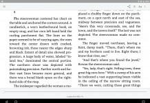
Lots of innovative work in the new poem app, The Waste Land, from Touch Press: synchronized text & audio scrolling; a birdseye navigator; a video “performance” of Eliot’s masterpiece by the actress Fiona Shaw. But one design decision that I keep tripping across is the placement of the annotations in the left column:
Why was this bothering me, I wondered? It’s because the layout imposes a “reading order” that feels disruptive. In English, of course, we read from left to right. So here’s the sequence that the position of these notes force you through:
- You start reading the poem on the center part of the screen,
- then you move back to the left column to read the note,
- then read down through the note and, finally,
- make your way back to the main text.
It’s too much zigzagging, I think. Better either to position the notes on the right side of the screen, offering a nice continuation of the rightward flow we enjoy when reading English. Or have the notes pop up, at a tap, which delivers the additional benefit of clarifying which note applies to which passage. (As I scrolled through the notes I sometimes got confused which passage each one referred to. It took me a while to figure out that the roman numerals preceding each note weren’t referring to the poem’s roman numbered main sections…instead, they indicate whether a line has multiple notes.)
Via Peter Meyers’ A New Kind of Book


