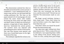
 All the people and businesses who have concentrated on making e-books easier to read might actually have been doing things wrong all this time, at least from the standpoint of education and retention. The BBC reports that a Princeton University study shows that using difficult-to-read fonts leads to better information retention.
Volunteers were given text about made-up aliens written in different fonts (16-point Arial pure black vs.12-point Comic Sans MS 75% greyscale or 12-point Bodoni MT 75% greyscale), distracted for 15 minutes, then tested on the material. It turned out that the ones who had the harder-to-read fonts remembered 14% more on average.
When the researchers tested these results in the real world, on secondary school students, they found that it continued to hold true—students given the same supplementary learning materials in harder-to-read fonts (including Comic Sans Italicized—ugh!) scored higher in classroom assessments.
The reason behind this, the researchers suggest, is that the harder-to-read fonts cause those reading them to have to concentrate harder on the text, and better retention is a side-effect of that concentration.
The researchers think the study could have significant implications for educational use, but others warn against assigning too much significance to these results—changing fonts might help (provided they’re not too hard to read) but is not a magic bullet.
I’m not sure what I find more amazing—the counterintuitive nature of the results (who would have thought that making something harder to read would make it easier to remember?) or that someone might actually have found a useful purpose for Comic Sans.
(Found via Slashdot.)


Line length can play an equal role in comprehension and a whole range of navigational and pacing features as well. It is probably not good to correlate a general effect with a single feature.
Imho this is why psychology is not a science and will never be. There are a host of possibilities that may be feeding into this ‘result. Often when learning, a change in page colour, or layout style or a myriad of issues like that can stimulate you to recall what you read better than usual. of course if you continue to use that changed aspect the effect wears off. It’s the change and the unusual that causes it to stick in your mind.
Ubiquitous variables aside, lol@comic sans having “a useful purpose”.
I could come up with a study in an hour that says the mere sight of prose in Papyrus makes 80% of humans want to run and hide.
To be fair, presumably they controlled for the other variables in their experiments. That’s what scientific experiments tend to do, you know–test only one variable at a time.
“someone might actually have found a useful purpose for Comic Sans”
I good laugh to start my Sunday. Thanks!
Hey Meredith … I use Papyrus in the headers of my personal letterhead LOL !