
 How do you like your e-books? Should they follow the designer’s intentions? Do you worry more about ease of reading? Or do you consider the two to be one and the same?
I’d side with the “ease” faction.
But not everyone agrees, and I’m happy to point you to an interview that Mark Nelson did with Robert Maxwell Case of SeeAndBelieve.com. Robert, a musician into “country classics,” says he worked part-time as a graphics designer and found himself unhappy with “then-current digital halftoning routines.”
“Picture of the page”
The result was ReadAllOver, “a digital halftone-based graphics system suitable for eBooks. It renders on the screen a digital page with the ‘look and feel’ of a printed page, with all included graphic elements, typography and images, placed precisely as the graphic designer intended. It differs from existing Web browsers and .PDF viewers in that it relies less on text files and font metrics and instead places more emphasis on a simplified, highly-compressible bitmap image. In many respects, it is a ‘picture’ of the page, with an ancillary text file.
 “The Sony and Amazon eBook readers are primarily text-based, offering a limited number of typefaces and few graphics. They both use the E-Ink subtractive screen and we think ReadAllOver’s halftone system can be tailored to enable a good fit with that screen.”
Speak up!
What do you think, gang? I’m of course partial to all-purpose, reflowable formats like ePUB that work on a number of machines and place the emphasis on readers’ preferences and on reduction of costs for publishers, so we can get more books in E. But not everyone would side with me. Whether you agree with Robert or me, speak up!
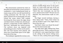
About the image on the right, from the Nelson blog: It’s a “sample of ReadAllOver output,” but “Details may not be representative, images were resized.”
Robert’s response to people bringing up the reflowability issue: “I’m thinking that the desire to zoom and reflow is really rooted in screen resolution and size. If I can’t read the small text, I want to enlarge. Then if it doesn’t fit right on the screen, I want to reflow.
“I own an older Dell laptop with a high resolution 15” screen 1200×1600 pixels. It translates to about 140 dpi. It was a failed product because at the Windows default of 96 dpi, all the fonts rendered too small. I used it to see what scanning resolution on my process was needed to convert an 8-1/2×11 magazine page to make it comparable with the printed version. It turned out that outputting to around 100 dpi gives a pleasant reading experience compared to print on that screen.
 “So the Apple iPhone at 150 dpi, the Amazon Kindle at 166 dpi and the OLPC XO at a nominal 200 dpi will all work if, as you say, the navigation of larger pages can be done gracefully. One way would be to halve the page vertically and horizontally like folding a newspaper and zoom to those quadrants from a small rendition of the whole page that fit the screen. That would work if there are two or more columns on the page—if there was only one, landscape mode and scrolling might work.
“Of course, designing especially for screens would resolve everything. But since designing for print is so entrenched, there will have to be some kind of bridge between the two. Likening it to the transition from horse-drawn to automobiles, road design had to be changed. As for screen size, I’m sure that will be consumer preference with more standardization … maybe along the lines of ‘one hand devices’ and ‘two hand devices’ (with 8-1/2×11-facing being the largest).
“I’m attaching a picture of the Dell 1200×1600 screen, flipped in Photoshop to emulate a facing page magazine.”
David again: I’ve lightened up Robert’s image a bit for easier visibility. Click on it for a full-sized look.
I’m still not convinced. This-here screen – size – standardization stuff could get tricky, for example, and while I appreciate Robert’s interest in letting viewers make some size adjustments, I still think the traditional reflowable approach is best. But what do you think? Be civil and constructive and help Robert—who’s spent 15 years on his technology—with your feedback.
Technorati Tags: Robert Case Maxwell











One of the beauties of the web is the central idea that content can be separated from representation. A single web page can look differently on multiple devices, conforming to the fonts available, to the screen dimensions, to the graphic resolution, and to color mappings. I happen to think this is a good thing. My eyes are not as sharp as they used to be, so the web allows me to select larger fonts. However, it has been an ongoing war ever since HTML was first launched.
I know that graphic artists hate the idea that their work could be re-flowed or altered in any way. If I’m reading a book on my (hypothetical–I’m a poor ePublisher) iPhone, though, I don’t want a shrunken version of someone’s beautiful page, I want something I can read.
Rob Preece
Publisher, http://www.BooksForABuck.com
Robert seems to be suggesting scrolling to read text on a Kindle–this just flat out will not work. The screen refresh time on a kindle is something like 3/4 of a second–and that’s if you’re working with text, and not image files, which take noticeably longer to load.
I’m a Kindle user, and I like the device very much, but we need to be realistic about its limitations. Plus turning a text page into an image file would seriously compromise the ability to change text size on a moment’s notice, which is one of the strengths of the Kindle (or other e-book readers).
Finally, as a reader, I read a book for its words, its ideas–not its “look and feel.” For me, the ideas *are* the “soul” of the book, and the rest doesn’t matter very much. If I were offered the option of digitally imaged books on my e-book reader I would actively avoid them to go for the small, quick loading, reflowable text files.
Cat writes:
<blockquote I read a book for its words, its ideas — not its “look and feel.”
While I would agree with this statement for the most part, I’ll admit to having some personal preferences when it comes to the presentation of an e-book. I’m not a particularly fast reader and I have a personal fondness for 10-point Palatino, which I find I can read more quickly than the 12-point sans serif fonts that seem to be the default for most e-books. In fact, I care enough about this matter that I spend a few hours reformatting all the Project Gutenberg texts I read as XML and push them through the home-grown publishing tools I’ve developed for my own use so that I can read them in my preferred format. And since the source is XML-based, it’s a simple matter to also generate an edition of the same works for my wife, who prefers the 12-point sans serif fonts that I dislike.
I can also see an argument for preserving the original designer’s layout for certain texts. I have a number of hardcopy editions in my library for which the presentation is a large part of the books’ value, and these volumes would lose a great deal of their charm if they were neutered into a bland HTML presentation. I haven’t yet seen any e-book equivalents of these hardcopy editions, but there’s no reason to assume that they won’t arrive some day.
I should probably qualify these statements, however, by pointing out that I refuse to pay good money for DRMed content (or, at least, DRM that I can’t break, DMCA or no DMCA), so the issue is moot for the most part with regard to current titles. Despite my sometimes vociferous advocacy of e-books, I continue to purchase most current titles in hardcover editions. Sic semper tyrannis.
My experiences with reading various reflowing media (iLiad (various formats), web browser, Ice book reader, Microsoft reader) and various non-reflowing media (pdfs and cbrs—digitised comics) leads me to believe that reflowable text is a vastly better solution to reading on a digital device. I put up with the scrolling to read cbrs using CDisplay but they’re tiring and frustrating to read. I tried to use Marvel’s web site to read some of the digial comics that they have available there. I also found that to be a frustrating experience, much more so than using CDisplay to read the same titles.
While I can see why a graphic designer would be worried about these issues, Personally I prefer reflowable text. It may be that when we have ebook readers with A4, full colour, 250–300 dpi fast refersh screens then this ReadAllOver technology may become useful. Until then I’ll take the reflowing text version any day.
What’s good about this: if the images take up less size than png or jpeg or j2k files, it would make for an advancement over these.
It would be an excellent way to archive historical books, books of beautiful design, where there is appreciable interest in the book as a physical/historical object. Medieval codexes, manuscripts, very early printed books, for example.
Archive.org and google books have a similar aim. So if this format results in smaller-file-sizes for the same books, it’s a tremendous step forward.
What’s bad about this: You can’t search images. (Is there text ‘behind’ the images as Google books does? If so, this objection is negated.
Most people are less interested in how the text of a novel was laid out, and more in what the author had to say.
I notice that in the example, the full margins are reproduced. Interesting.
If the book was not beautifully-designed in the first place, I see no reason in particular to be slaves to the low-paid lead-slugger who laid out the pages, as fast as he could. There the only interest would be highly esoteric: ‘this is what a cheap edition of Dickens looked like, compared to this deluxe volume.’
Historians of the book would be interested in this. But when the day comes when the historians amount to any significant proportion of those who buy ebooks, then NOBODY will be reading. Alas.
Every variation on this kind of thing is interesting, and expands the range of possibilities. Kudos for at least doing something!
I am not sure about the others but my idea of an E-book is having a electronic device which display image, text that gives the reader the look and feel of reading off an actual book. Produce quality image pages with small and compressible file sizes I think it is far more important than functionality of re-flow. All the E-book technologies out there currently have the functionality of re-flow for their text, yet none of them are able to produce a nice sharp image. Sure, if I only cares about reading text then re-flow works nicely, but what if I want to read “Time” or “National Geography” magazine or School text book the way it is? Re-flow is going to break at the places where it shouldn’t and the page may lay out awkwardly.
Nevertheless, I think re-flow is not as important compare to having a compressible but yet high quality images. Because lets face it, E-book technology will most likely takes off in the future, by then the material we read on it won’t be limited to only text.
Now as far as search ability on Robert’s technology. I think that can be solved. Just put an invisible layer on top of image layer and embed the coordinate of where the word or the text is located, maybe in the header of the file? Correctly me if I am wrong but I believe PDF is already doing that.
I appreciate all of the comments in this discussion.
Thomas is absolutely right about search … I had planned for the adjunct text file to link to coordinates in a surface layer. That mechanism would also allow for highlighting and margin notes.
I feel that the “value-added” in the ReadAllOver technology lies in the halftoning algorithm that handles both images and text simultaneously. I would think it would be good for books with symbols and charts, as well as any of the world’s languages (in any font), without reliance on vectors and font metrics.