


I noticed this morning that my Kindle for iOS app had been updated and included the new font, Bookerly, plus new reading enhancing improvements. Here’s what Amazon has to say about the improvements:
Faster Reading, Less Eye Strain
Hyphenation plus smoother word spacing result in faster reading with less eye strain.
Improved character placement increases word recognition speed at any font size.
Nate covered this story at Ink, Bits & Pixels, and has been in back and forth conversations with several people on Twitter who were not noticing the improvements. So I decided to take a look
According to the Amazon page, the improvements are available on the Kindle for iOS apps and Fire tablets. They are also available, for now, on a limited number of books, a few of which are listed at the bottom of the page. Good news. I own one of the books, so I tried it out on both my Fire and iPad.
Sadly, I don’t see any improvements, other than the addition of the Bookerly font, which I haven’t tested long enough to know if I like it or not. As you can see from the following screen shots, there’s no hyphenation or improved kerning. The drop cap is kind of pretty, though. I deliberately used some large fonts because Amazon had indicated the books would work at any font size.
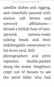
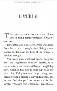

Has anyone else tried the updated app and noticed a significant improvement? Lucky for me, I can get away with a smallish font, and the lack of hyphenation and kerning hasn’t been a issue for me. I can see, however, that someone who relies on larger fonts could get irritated quickly.


Drop caps on the iOS apps have been possible for some time now… at least two years.
@Rob, I know. My books have drop caps. So I was pretty underwhelmed by these “new options.”
Ah. I misread. I think the change has more to do with consistency with other Kindle flavors. The implementation on the iOS apps is pretty rotten.